In reference to the new update, I appreciate the unified design, but its not adapted for the web at all. There’s so much wasted space and everything is centered on the left side of the screen, as if the other half of my screen is dead. It appears as an odd port of the design, could this please be reconfigured to have it take advantage of the full display?
The space below the movie poster doesnt bother you?
Its kinda wasted and moves the actors down even further.
this is how it was before:
https://i.imgur.com/NdZu0ZB.png
and this is how it would be better:
https://i.imgur.com/9DMKgoZ.png
now yes, this isnt really an “issue” but it looks so weird. actors get pushed down even further if the movie description is a little longer.
It doesn’t bother me, really. It doesn’t push things down all that much, and if there’s a long description, it gets hidden with a “Read more…” link. I wouldn’t object, and it would address your issue, if the writer/director/studio info were also hidden with a “Read more…” link as well.
I do understand how you feel, though. I had a similar issue with music detail pages a couple years ago, until they redesigned the page.
I’m very happy, though, to have the play controls under the title instead of on the toolbar at the upper right.
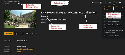
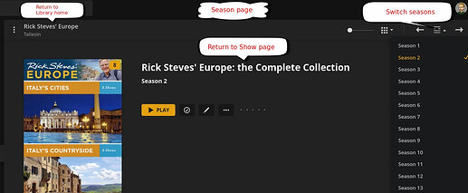
Also, there is no way from a episode page to go back to the whole season or the tv serie page.
They’ve just changed a bit:
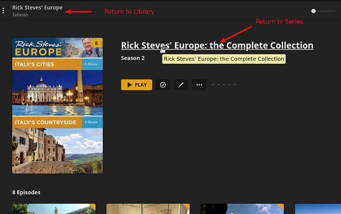
They’ve removed the “breadcrumbs” at the top of the page, but you can still click the Series or Season name to return to the season page:
They may have changed it just a bit, but where’s the ‘match’ or ‘fix match’ or even ‘forget match’ etc?
Usually I like, change, but this change has lots of regressions. Taking away the ability to manage the library is a quite of a nuisance.
I think your screenshot is from a shows season, rather than the top level of the show.
I think you only get the match options (fix, unmatch) when at the show level, not the season level
Well, then tell me where the option ‘go to tv show’ is hidden? I can’t see it in the drop down. Is there a manual for this new UI design? It’s not very intuitive (anymore).
Use your Back arrow in the browser.
That brings me back to the home screen. Not the screen for this particular tv show.
I see you entered the show from home screen and not from TV show Library.
The ellipsis is at bottom left of show poster in it’s TV Library
Why can’t I go from the TV show season back to the TV show itself? On all the other clients (iOS, PS4 and plex client for macOS) there’s an option “Go to show” or just click in the bread crumbs to go to the tv show… Surely this feature must be still somewhere present in the screen of which I linked the screenshot I linked?
I like all of the suggestions, but none of them answer my questions. Instead of doing this goose chase, do any of you know if there’s a manual for this new UI design?
It’s PREVIEW, as in such it is developing. If you don’t want to work through with it, opt out.
For me I find it a Fresh and a cool UI. Try clicking on the Title “The Baby sitters Club”
Ah, finally. Thank you so much, Beckfield.
It wasn’t really clear for me. Let’s hope, if they keep it this way, that they’ll present the hyperlinks as actual hyperlinks and not as hidden hyperlinks which only present themselves when hovering over it.
I’m sure the Plex UI people will make something beautiful out of it.
I don’t think unsubscribing from the beta channel will prevent this UI from coming my way. It only delays it.
Usually the changes they make in the web UI are very intuitive. For me this the first time in the eight years I have a plex pass, they come up with counter-intuitive UI change: the hidden hyperlinks.
Beckfield answered my question a few minutes earlier than you did. Nevertheless, also I would like to thank you too for the answer, SE56…
The hyperlinks have been there all along. You can still see a previous version by running the local version of the web UI (until it gets updated).
http://localhost:32400/web
Interesting. I haven’t used the localhost web player for such a long time I had to set-up the home screen 
On that screen, I have always used the bread crumbs to navigate the hierarchy of the libraries and never know you could click those titles and such. Like I said, if they’re hyperlinks, they should definitely look like hyperlinks. and not like hidden hyperlinks, then I would have noticed it for sure.
Beckfied, thanks for pointing that out!.
I wonder If I’m the only one, since I’m sure Plex has collected a lot of usage information/data by now to know how people navigate and use the plex web player. It must be a small group then and I’m probably in it.


