It’s not really intended to run in full-screen mode, for a variety of reasons.
Too bad, I think it would make an already sexy app even sexier! I use Plexamp maximized a lot of the time, either on one of my 2 displays in my work setup or on the 2009 iMac in the living room that’s used primarily for controlling my music. Would be nice if I could just get rid of the menu bar and have a proper full-screen mode. (so it’ll sit between other desktops and full-screen apps on MacOS).
Surely this thread has enough votes to have another look into this? ![]()
I know it is basically the mobile app, contained in a wrapper, but I think it’s the only Mac application I’ve used so far which omits these controls.
I also use Plexamp on two NUCs that both have a display attached, running Plexamp on full-screen. This is to nicely display what’s playing and what’s coming. I have disabled the Linux task bar to only (and only) show the Plexamp screen. A top bar in the full-screen-mode would not make things look nice. And since the control is done using mobile device and not on the NUC itself, it makes the top bar and any other addition for my personal case totally unnecessary. My two cents.
Unfortunately, Plexamp is still lacking a feature to minimize or even display playing status in the menu bar. It feels like a ‘hotmess’ currently.
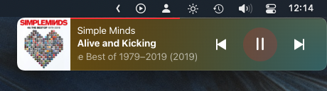
macOS Notification

macOS Now Playing

It would be nice to have a clean Plexamp icon in the menubar, that can be clicked and displays the Plexamp window or a part of it.
Perhaps with options to turn on a scrolling section displaying what’s playing when it’s not displayed, like Spotica!

I don’t really see the problem with the notification and the standard MacOS “Now Playing” view?
Seems well implemented.
Still missing the window controls/fullscreen option every day though… ![]()
Add minimize, maximize and close buttons to windows plex amp please.
Not sure why these basic buttons that 99% of windows apps have are not present?
Because we wanted to create the 1% of music apps!
Elan lets improve plex rather than just make jokes and shrug. If you want an app that runs on windows don’t half ass it, make a proper windows app.
It was never intended to be a “proper windows app”, the philosophy was something tiny you throw in the corner and leave alone (like Winamp). That might change in the future, but that’s why it is the way it is.
Thanks for explaining your rationale. Now… lets make it better. Why not compete with roon, audirvana, musicbee, foobar etc etc ?
At least let it be minimized to the taskbar, perhaps displaying some minimal info / buttons.
It should have basic controls over window, it’s crazy how hard it is to grab plexamp to move it somewhere else or close the window/minimize. I guess it’s not issue to add Windows default frame with buttons to the app, especially for 3 years of complains from users.
It lacks intuitive controls that desktop player should have.
@elan can you please have another look into this? Normal window controls & window behaviour, both on Windows & Mac would be much appreciated!
I agree with this sentiment and voted on this thread. Just started using Plexamp yesterday and as a certified usability analyst, the Windows app makes my brain hurt. Some minor tweaks to the navigation and workflow would go a long way to take this from sub-par to just average. I didn’t understand how to move, close, minimize, and navigate back to the “home screen” until AFTER I read posts here and on Reddit. That’s not right. Not everyone is going to do that. Most will likely just quit and move on.
If it was never designed to be a “proper windows app” then why release it at all?
I echo all the other comments on this thread - your team has done an AMAZING job on the mobile app.
If you never wanted to create a Desktop app, then it would be better to not release one tbh and recommend the Plex Web interface instead.
If you want to release a Desktop app then you should pay the same attention to the UI/UX that you did the mobile app.
The current iteration of the Desktop app looks and feels rushed, unfinished and unprofessional in my opinion.
I love Plex - it is my daily driver for listening to my music collection and Tidal integration (don’t really use it for TV/Films) but the massive differences between mobile and desktop apps is jarring.
It was never designed to be a “proper Windows app” but since it is LOADED with features now, sophisticated features which beg for exploration… Then I think the design goal needs to change.
I get hard time recommending Plexamp to my friends because the desktop app is not user friendly - on both Windows and MacOS it is the only app that I cannot minimize.
On MacOS I have to use the iPad version, because it has the window control buttons (added by the OS itself) but the iPad version is not intended for desktop use, so it crashes often.
So, please, add simple desktop window control buttons, it is the main thing that is missing from the app.
Man, that is not slick.
Plexamp 4.9.4 has added an option to display regular window controls on the desktop platforms. Therefore I’m considering this suggestion to be implemented.
Added
- …
- Desktop: Added an option to enable the system title bar and window controls.
My OP was two different suggestions but the title bar change is one of them. ![]() Great update, thank you Plex team!
Great update, thank you Plex team!