Server Version#: 1.24.1.4931
Player Version#: Roku 6.9.1 (public); Roku 6.9.2 (preview)
A few inconsistencies and bugs with TV episode navigation and UI\UX\Presentation I’ve noticed recently. I’m not sure if they are by design but they feel like bugs\regressions so I wanted to mention them.
Played\Unplayed\Watched\Unwatched flags:
When navigating to a show with one season and the “hide single seasons” option is enabled the markers for watched\unwatched are flipped between show view and season view.
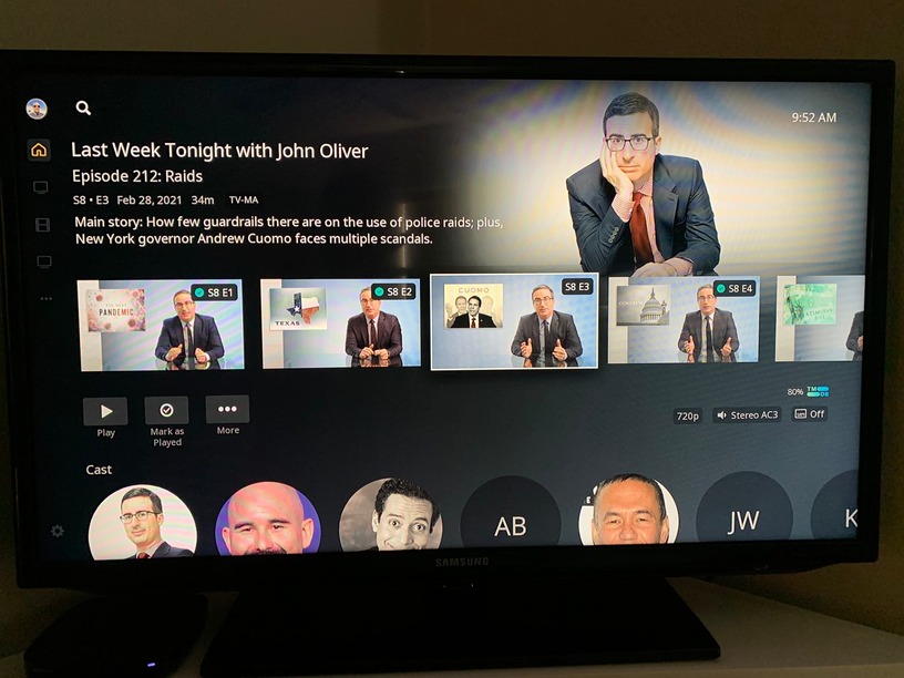
Show View uses “unwatched” orange marker(note 3rd episode in image):
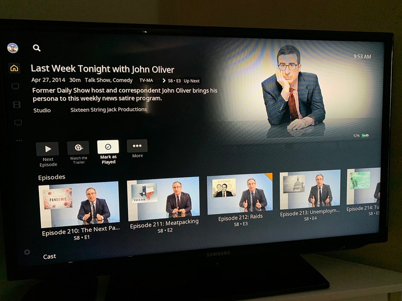
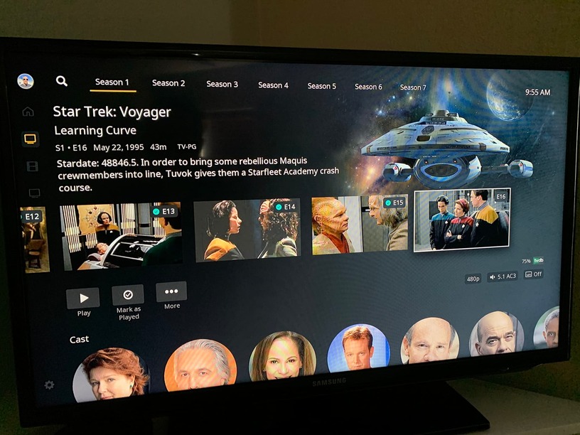
Season View uses “watched” green checkmark (3rd episode in image):
Previously the green checkmarks showed at the Show level view as well.
“Played” vs “Watched” Terminology:
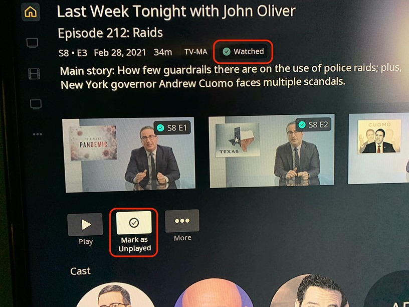
Similarly, the button to change the status of objects says “Mark as Played” or “Mark as Unplayed”, but the status indicators state “Watched”. Just an inconsistency in language I’ve noticed in various areas … are they Played\Unplayed or Watched\Unwatched? Minor quibble. ![]()
Episode Selection Navigating Into Season\Show:
When navigating into a Show or Season that has unwatched episodes, the thumbnail view defaults to the first episode instead of the “next episode” (the first unwatched episode). If I navigate to Star Trek: Voyager and season one has 1 episode left to watch, when I click into the season I see this:
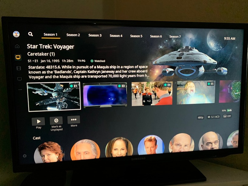
I now have to click 15 times to get to get to the unwatched episode:
Episode Selection Navigating Back from Post Play:
If I start watching Legion from episode 3 and then continue to watch episode 4 and 5 I’ll end up at a post play screen with Episode 6 as the next play. If I then choose to click Back from there, my view returns to the season view with the watched episodes marked as watched\played but with episode 3 selected. If I want to watch the next episode now - episode 6 - it’s off screen and I have to click past the watched episodes to get to it.
In both of those navigation examples I think the most recent unwatched\unplayed episode should be the displayed\selected episode and I am pretty confident that’s how it was working previously because it feels “wrong” to my muscle memory now.
Nothing here is broken or keeps me from using Plex just fine but it feels like some of the QoL polish rubbed off … I first noticed - and reported - the navigation changes partway through the Modern Layout experiment so I’m hoping, for my personal preferences, that this is an unintended side-effect of those changes.