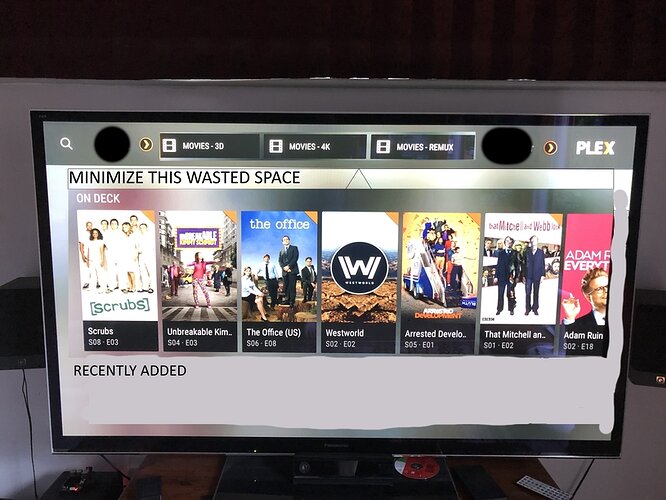
These thoughts are all in my own opinion, I’ve pasted a terrible photoshop job of what would be a huge improvement in my eyes. Hopefully some of the dev team @sixones @ManuelPG may feel the same?
-
Move the sections to the top bar that I can scroll through ala “Plex for Kodi” if the same style as Plex Media Player cannot be implemented.
-
The “Discover” section takes up too much space. It could be moved up so it’s right under the top bar. Would regain space perhaps allowing another row to be briefly seen below On Deck.
-
Minimize gap between On Deck text and drop shadow of Discover sections. On a 10" TV interface I should be able to see what’s below On Deck even if only briefly so I don’t have to scroll down to see there’s something below it.


