I strongly dislike the new layout. I find it as ugly as it is an ergonomic downgrade compared to the current clients. Everything is way too big and it lacks identity but let’s put that aside as most of my concerns have already been reported by others and as the idea is to put emphasis on the visuals (nothing bad on paper, on the contrary, it’s just poorly executed), I guess it probably won’t change much anymore.
So let’s take it as it is now and consider two or three more basic things.
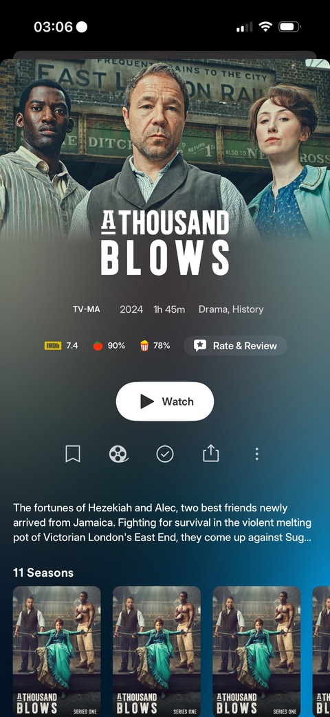
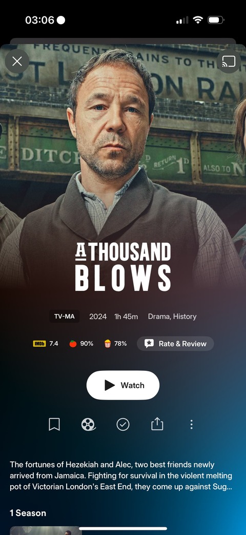
The logos
While it can be a nice addition, many of us spend countless hours to search for, curate, edit or create our very own local media assets and don’t want them to be mixed with stuff we have no control over. I, for example, absolutely don’t want bad quality or foreign language logos or simply logos that aren’t the same as the ones I already use on my posters. And good quality logos, if not sometimes logos at all, can be particularly difficult to find, more so than anything else. For these reasons we absolutely need flexibility through the following options.
To be able to:
-
Disable all the logos completely
The logo could be replaced by the title in true text as it’s already the case when the logo is missing or, better, by the poster. The poster is badly missing. It could also be a simple choice between displaying either the logo or the poster on smaller screens with no place to display both, maybe. Still should remain the option to disable logos completely on bigger screens. -
Enable only locally stored logos
That means only displaying logos that are local assets. The others would be replaced just as described above.
Optional but highly recommended, we also could get:
- A checkbox at an individual, per item level
To choose whether or not the logo is displayed.
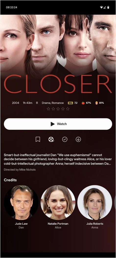
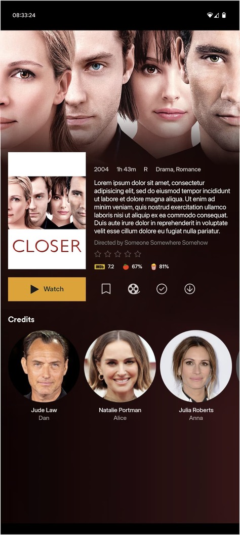
The posters
Just as said above, the poster is badly missing on the details page. I can understand and accept it on a phone where space is limited (though it is perfectly fine on the current clients), but the poster definitely should be displayed “big”, somewhere at least, on anything that is not a phone. On the details page, that would start with the smallest tablets, like the iPad mini. There’s well enough space so, please, don’t downgrade that too. For TVs, library view can almost display it big enough already, though the possibility to long press the poster to display it bigger on Apple TV is very welcome. Poster is and should remain the main visual asset after all. It should neither be the logo, nor the backdrop. Going that way was a terrible idea.
The backdrops
No, please no. You can’t crop the backdrops like that on both sides. The backdrop should fit to the width of the screen and never be cropped, it doesn’t work. Well, it sometimes does but in many cases it doesn’t. And yes, I’m also speaking about textless backdrops. Textless doesn’t prevent bad crops when content is on the side. Cropping the backdrops like you do now also make you push the actual content way too low on the screen. This is bad in all possible ways, visually just as in readability and practicality. Don’t do that, please. Fit to the the screen, don’t fill a squared block with 16:9 aspect ratio assets.
To end on a more global note, please try to avoid taking too much inspiration from the competition, because the more it goes on, the more it very often gets worse.
Don’t do like Infuse whose interface was already not good but which has become downright horrible since the last so-called major update.
Keep your singular identity and keep it clean and practical. The current clients are perfectly fine, don’t drift too far away.
And give us options…
Lot of options…
Let us disable stuff.
Please.