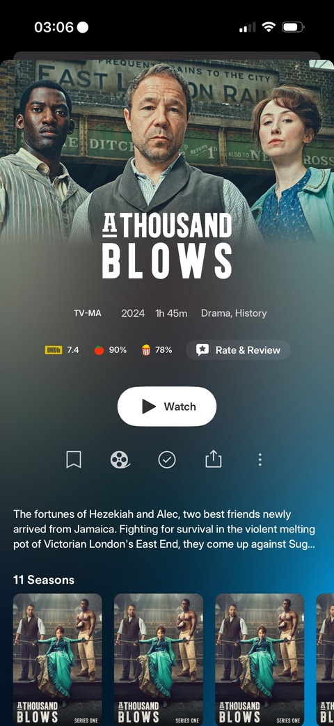
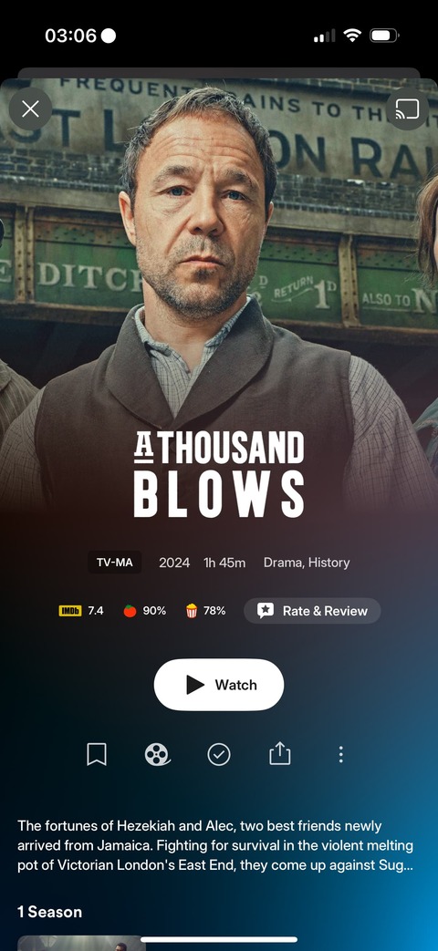
If at least this new UI proposal were properly executed, respecting simple design principles to avoid unnecessary constraints and complications — by simply using source images consistently according to their aspect ratio, for example (sigh…), the most elementary thing in the world — it would help to make things easier to swallow and I could personally accommodate, but no, doing this:
Instead of this:
Is too much asking apparently, even though that must be three lines of code…
And all this for absolutely no valid reason, be it in terms of practicality, readability, or ergonomics. It’s quite the opposite. Even aesthetically I would argue, as it rarely looks good when half the picture is gone when it wasn’t designed that way in the first place, which a backdrop picture never is.
This is all space wasted for nothing, for it to not even be looking good.
And it’s even worse on tablets.
And… and…
Even on landscape mode, they manage to crop the damn picture…
I mean…
Sigh…


