Not sure if I should have posted this elsewhere, but we’ll see.
I love the collections feature and on most platforms I’ve used, it makes navigating a large library of movies a lot easier. But I’ve found this isn’t the case on Plex for Samsung 3.109.2.
When using the Plex app for Windows, I enter a collection and I’m presented with a Grid view of all the movies within that collection. I also have options to change the view to List or Summary views as seen here:

On my Samsung TV, which myself and the majority of my users are watching Plex on most of the time, you’re not provided the same experience. On Samsung TV’s, when you enter a collection, the top half of the screen is ultimately wasted real estate and along the bottom you get a list of movie posters to scroll through. As seen here:
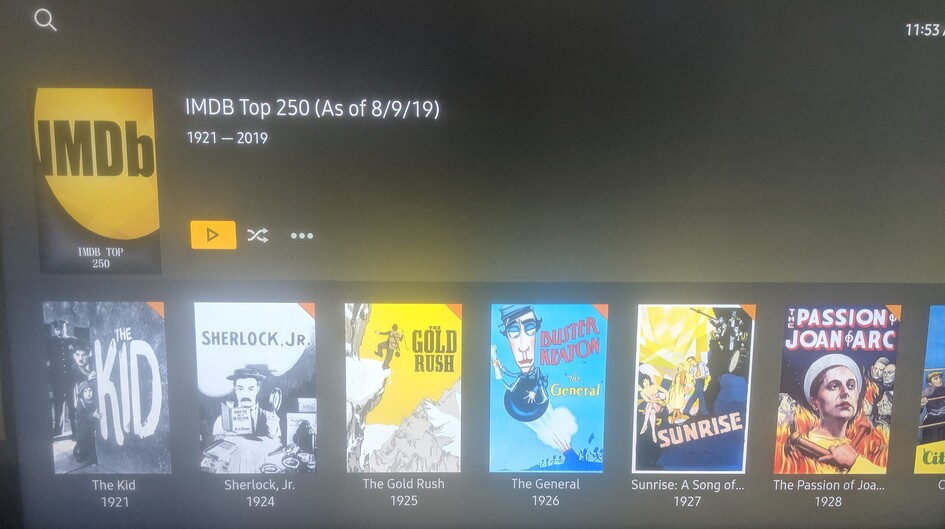
(Sorry for the image quality)
Only 6 movie posters are displayed on screen at a time and you have to scroll left and right to find what you’re looking for. Due to the limited sorting options for collection contents, this means to watch the newest movie in the collection, or a movie that starts with Z, depending on the sort method chosen, you have to scroll through the entire collection. And of course, the collection doesn’t wrap, so it’s a one way scroll. For the collection above, that’s 250 movies at 6 per screen to scroll through. There are no other view options available such as Grid, List, or Summary, as you would expect and that are available on other platforms.
The wasted screen space, the lack of view options, the lack of sorting options, and the lack of wrapping, completely negate the convenience of collections on Samsung TV’s. It’s actually more cumbersome to look through a collection than it is to scroll through the grind view of my entire library.
I guess my questions are, why were collections implemented this way on Samsung? Why did Plex decide that wasting half of my screen was a good idea? Why are there no view or sort options once I’m within a collection? And are there any plans to improve this in the future? As it is now, I feel as if I’ve wasted my time creating collections because I can’t bare to navigate them on the platform I, and my users, use the most.