Plex Web 4.73.2 UI Regressions

Have noticed some UI regressions with the 4.73.2 webui update which was rolled out to app.plex.tv today:

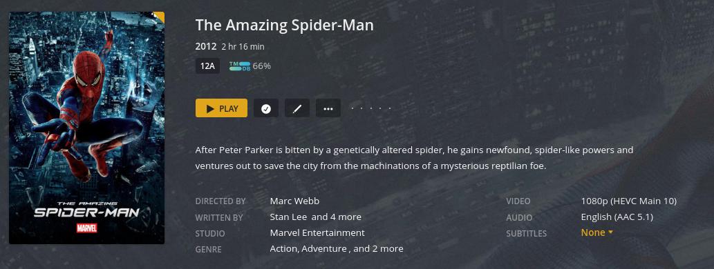
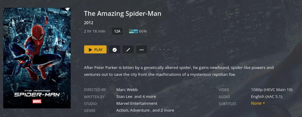
First is a layout problem: Notice the year in this movie. The duration of the movie is to the right of the year and looks to be using a smaller font than previously, it actually looks a little squashed.

Via → https://app.plex.tv/desktop ( 4.73.2 )

Via localhost ip ( 4.69.1 ):

If you load up a browser with both pages open and switch between them its very easy to see.

Second problem: All movies now have a yellow unwatched triangle on the top right corner of the poster art even if the movie is watched. Again, see screenshot above as an example. You can clearly see on app.plex.tv is reported as unwatched but on localhost its watched.

1 Like

Can confirm both, but issue #2 only shows in detail view, not in grid view.

EDIT: Detail view as in you click on a movie to see its details.

Correct – should have said that, thanks.

and still an issue in 4.73.3

1 Like

also using down arrow key on a keyboard in the web ui no longer works

Still available in Plex Web 4.74.1 and Plex for Windows 1.40.1.2823

Not too sure about #1 and the sizing but #2 has been filed and should be fixed in the next release. Thanks for reporting!

1 Like

What aspect are you not sure about? Is it that you can’t see the difference or you don’t agree it looks worse now?

The year and duration is clearly squashed IMO. The duration was better from a UX perspective where it was previous.

That I see a difference in the sizing or that it looks worse. However, I have raised your issue all the same. Again, thanks for reporting it.

1 Like

I mean, I don’t mind having all the info on the line underneath the name. Saves space and moves things up. There is a lot of wasted space on the upper right side :slight_smile:

100% agree. As long as its spaced out well. Currently it’s not IMO between the year and the duration. Anyhow, I’ll shut up now before I start ranting… :grin:

afaik we are updating that to look more like a detail screen from https://watch.plex.tv. It does look like we did not complete or a component is missing as the dot between two is missing and the duration font is smaller.

Thanks, if that’s the goal then great.

Second issue I reported above is fixed with 4.75.0, thanks.

First layout issue still exists. I look forward to when it’ll match https://watch.plex.tv as it’s messy/squashed at moment especially when compared to how it looked previously.

This topic was automatically closed 90 days after the last reply. New replies are no longer allowed.