Currently the PC version of Plexamp is using the same interface present in the Android and I assume iOS release. While what’s present works great for touch controls and small displays, the user experience doesn’t translate well when blown up on a display greater than 1080p. This was brought up before in a previous post, but was closed due to inactivity and I would like to try and spark the discussion once again.
Simply put, listening to music on Windows using Plex Media Player isn’t exactly ideal because of its interface being more tailored to video consumption as well as a lack of features in comparison.
Edit: Changing this to a feature suggestion and elaborating a little bit further:
General Issues I Have With the Current Interface:
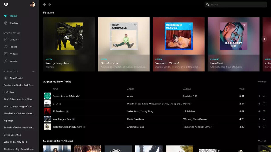
While the Album, Artist, and Playlist views are completely fine the way they are, the UX isn’t designed for mouse input and maybe it’s just me, but it seems pretty clunky. For example, if you were to go to the artist view and look at an artist, but then wanted to switch back to album view, you would have to back out to the artist view, then back out of the library, and then enter album view. For a mobile app where you’re working with limited space, that makes total sense.
A Potential Solution
It would make sense to have that library view as a collapsible sidebar for easy on the fly switching between views. Simply moving the downloads and settings to the sidebar and the search bar to the top right completely removes the need for a bottom bar, which in a app that is designed vertically, is pretty important on a horizontal display.
Artist View:
Naturally, Plex has a plethora of things that it can show you through its metadata, from artist bios to album reviews. This artist doesn’t have a description since they are pretty niche and weren’t around too long, but pretend that they do and that it is tucked at the bottom of the page. Next to the Artist Image, there is plenty of wasted space where a bio could easily fit, along with Artist Styles and Moods. It would be nice if instead of the UI expanding vertically, it could expand horizontally as well, allowing the user to see more things all at once.

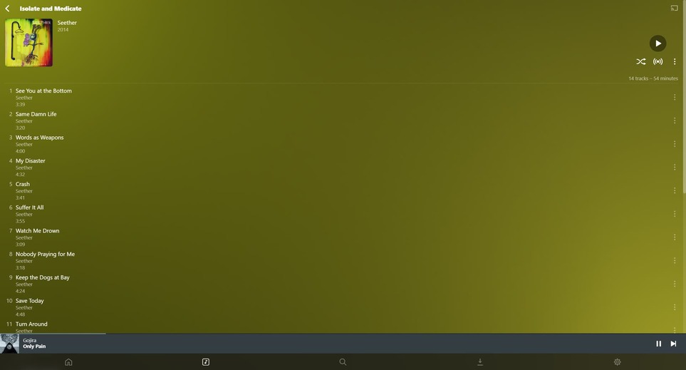
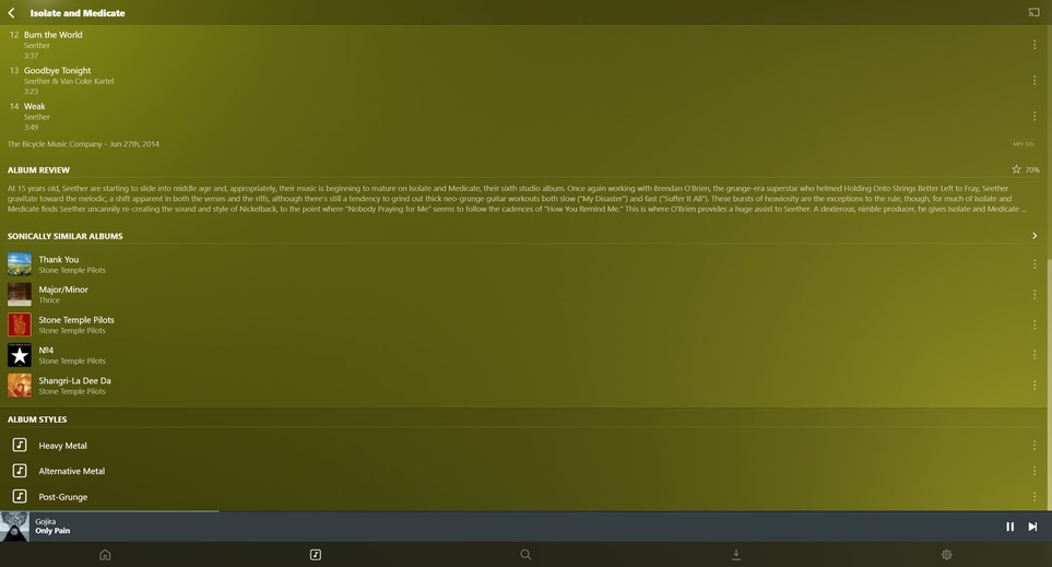
Album View:
Here’s an example of how an album looks in this manor…
And compare that to the way albums look in TIDAL…

Now, I have never used TIDAL and I am sure that it has its own sets of shortcomings, but both examples show almost the same amount of information in completely different ways. Another thing that bothers me about this design, is that the issue is even more pronounced on large compilation albums with 70+ tracks and multiple disks. Many players will split their tracks into multiple columns, which I feel makes the most sense here.
This is a bit of an exaggeration, but also a great example of this. This is a massive compilation album, even with 5 columns it cant fit onscreen (there are 5 more disks). Navigating this in Plexamp, is a huge pain.

On Plexamp, it took 21 downward scrolls (scroll wheel default sensitivity) to reach the bottom.
In MusicBee, it only took 2. With only 3 columns I assume it would probably take closer to 7 or 8, but that is still a huge difference.
Album Art View? Or Whatever This Is Called:
Last talking point, with the window maximized, this is view is a little unnecessary. Incorperating it into its own sidebar on the opposite side of the window, not only gives you a nice view of the album art, but gives you room to do some more metadata stuff.

This is how I had my sidebar set up in MusicBee
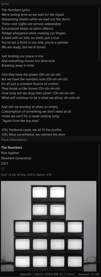
You could stick an artist bio in there, or an album review, or even scraped lyrics.
All in all, Plex has some amazing features, especially when it comes to metadata. But the way it is displayed on a desktop, and really any landscape oriented device leaves a lot to be desired. Now am I suggesting that you rip off the designs of other streaming services and music players? Absolutely not, but it would be really great way to show off what Plexamp can really do.