Some of the navigation in Plexamp could be smarter.
There are probably several places to smarten up the nav, but I am going to start with one because I think it could inform how to approach making the interface and navigation more enjoyable to use.
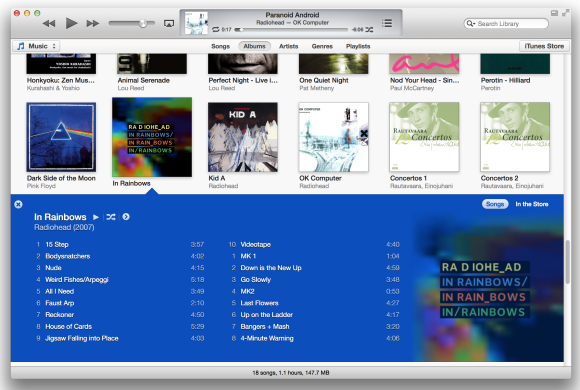
So, I think it would be great if some of the deeper content (such as album song list info) was simply shown in-line instead of drilling down or opening like a folder. See my mock-up image.
What I would like is when I click on an album, it just shows the info right there in-line, and the albums below it are simply pushed down to the next row so I don’t have to ‘close’ the in-line box if I want to click on any other album while the in-line box is open. In addition, I would love to be able to then scroll the song list within the box.
I think this would make playing specific songs a easier, as well as making playlists much much faster to do.
Please consider doing this kind of thing throughout Plexamp to make navigation less arduous and more compelling!