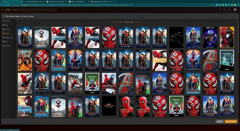
Some movies have dozens of poster to choose from, and I think it would be much easier to be able to view them in a larger modal. Right now, the modal is a set size that shrinks if the window gets too small, but it does not enlarge to fit as the window gets bigger. Please see the screenshot and observer all of the wasted space!

I have actually found a workaround for this. I installed the Stylebot Chrome extension, which allows you to manipulate a site’s CSS. I added the URLs to my Plex server (local, remote, and plex web), with the following CSS:
.modal-dialog {
  height: 100%;
  width: 100%;
}

.modal-content {
  display: flex;
  flex-direction: column;
  justify-content: space-between;
  height: 100%;
}

.modal-body {
  max-height: none;
  height: 100%;
}

.modal-body-pane {
  height: 100%;
}
This does have a slight side-effect on the user selection modal (and probably other modals, which is subjectively good!), but it is still 100% usable. Hopefully this helps someone in the meantime!
Just throwing in that there’s already an older existing suggestion asking to increase the size of the edit window (or an option to make it resizable).
I suggest you comment/vote in that thread in order to avoid distracting/dispersing votes (as the poster picker is just one of the tabs on that window).
In that case I’ll close this suggestion as a duplicate.
Oh neat, that thread turned me onto this:
Sounds good. Thanks!