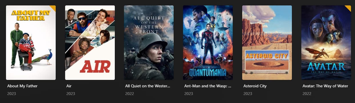
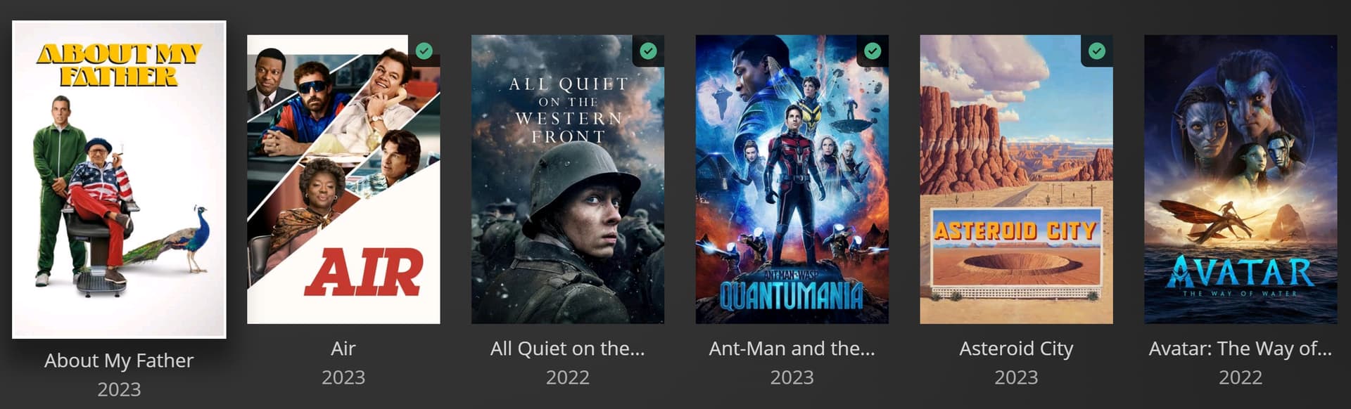
There was a recent change to the unwatched count on tv series where it was orange, now it’s grey showing a number and it’s inconsistent with the movies, quite difficult to see and personally I just don’t like change.
It’s worth noting this change is only reflected on the https://app.plex.tv and not the internal version.
I don’t like the change either, the orange is a visual system with the rest of the UI, the black is very incongruous, if it’s going to be changed I hope there’s an option set up for the user to choose for themselves.
The white text on black is by season (s). For an individual episode, the orange marker is still there.
It is perfectly logical and played/not played marker by individual item ties in with the Movies orange marker.
I think it works fine and hope they continue to roll it out across client apps.
Edit - I had concern with a roll out of a played/unplayed GUI change in Plex HTPC but really my concern is consistency. As long as the change is consistent across clients, it is fine by me. With my ageing eyes (and slight colour blindness), the white text on black looks great.
This is for TV shows where completed items don’t have the same indicator as a completed movie with a green check mark. Watched TV shows are blank the same way it’s blank in a movie library for something unwatched
Completely agree. I’ve chosen to assume such changes just haven’t populated through all the clients, but over time that assumption falls flat. Seems like they should all sync up more quickly (and in some cases, at all).
Black text on orange background is much clearer and more to the point, it has been like this for ages, so why change it? Is the unwatched corner gonna change colour too, just because? The background for the client is black, so it is definitely not a change for the better.
I need an option for “legacy” orange triangles. I despise how my library looks now with the green checkmarks. I also much prefer have my unwatched titles marked as opposed to the opposite.
I just don’t get why Plex mess with this stuff when simple things like hiding watched items is more requested. Using smartlists is just idiotic to hide watched items. Movies has an unwatched option but it sorts by rating ?
I can’t hide recently added but watched TV episodes.
Every other media library tool I use has this simple library management option.
Plex seem to go out of their way to change things that do not need to be changed and leave out simple common features.
The truble is, they also don’t make the changes consistent across apps.
What I really dislike is having Green Checkmarks now on every title I have watched. My entire library is now a sea of green check marks. I hate it. PLEASE revert back to no icons on watched titles, and orange triangles on unwatched titles.
Really wish I could vote for this but my votes are all used up. Stupid 5 vote forum rule.
I’ll recommend the plex moderators and ninjas redirect here from the many other threads which exist voicing dissatisfaction with this change. We need a single thread so plex can see how unhappy a lot of its users are.
At the very least, they could give us the option in the client. Nothing shows contempt for the user like acting like you know better than them. I cannot stress enough how incredibly opposed I am to this watched icon. It’s visually distracting, while the unwatched marker made sense. But regardless, let people have a choice. This is supposed to be my tool for managing my own server. It should be my choice. Also, as a senior engineer at a big tech company with user experience … uh … experience … I disagree, fundamentally, with the notion that people’s eyes should inherently be drawn to special notifications on things that are already watched, and therefore not in need of special attention. I know plex has lost subscribers to this change because they’ve said so. Just give people a choice.
It is heaps easier to find unwatched content when it is what is marked, compared with finding what isn’t marked.
Especially when the colours are so bad, when so many posters are black/dark in the top corner it is hard to see something that isn’t marked with black, compared with something marked in Orange.
I fully support people having options, but I for one would definitely prefer the unwatched being marked in a bright colour.