
When listening a track on mobile, you sometimes really do feel an urge to view the lyrics. Could we put a lyrics icon in the top right corner of this iOS screen? At the moment the user journey is 4 context switches, where it could be just one.
The playback screen could also get that lyrics button in the bottom left or bottom right - there’s plenty of visual space. Theoretically, lyrics button could be also placed next to a star rating.
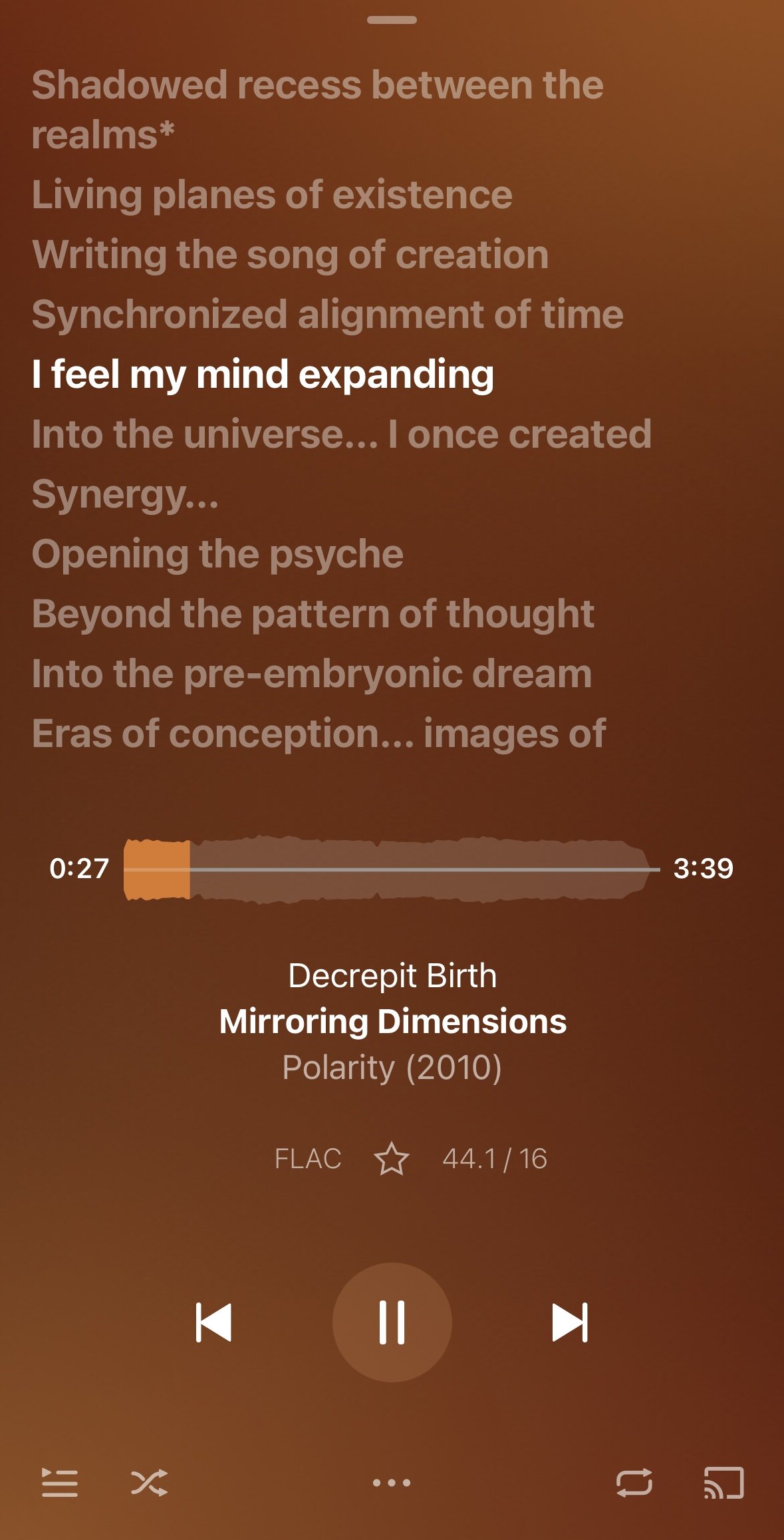
Shuffle and on-repeat buttons are arguably mutually exclusive. To be honest, I would rather see on-repeat button in the drawer than on the main screen.