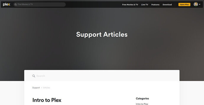
There’s a ton of wasted space on the Support page. I’ve disabled ad and script blockers, so nothing is hidden. This is the same on chromium-based and Firefox browsers:
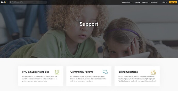
While we’re at it, the design of the Support landing page has gotten out of hand. Before, the first thing you saw were three big links to the most important Support options (FAQ & Support Articles, Forums, Billing Questions). The “Support” header was still huge, but at least the important links were immediately available.
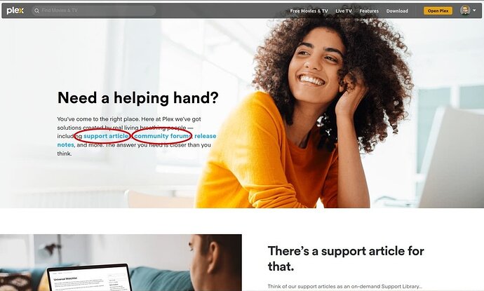
Now, I’m presented with a rather obvious, unnecessary, self-congratulating advertisement for your support options. I see links right there for “support articles, community forums, release notes.” Oh, good, those will take me where I need to… wait, no, no they don’t… all they do is just scroll down to more self-promotion and, finally, the link I need.
Why make the support page less user-unfriendly ?


