
Plex player for desktop doesn’t seamlessly render the window controls, showing this ugly gray window header, whereas other players, like Spotify, do seamlessly integrate with the window manager of macOS.
I don’t use Spotify or Mac as a daily driver so correct me where I’m wrong but it does appear that we do follow with the host OS’s Appearance setting. I have VLC, Spotify, and our Desktop app up. When selecting the Light and Dark themes, only our app is changing to match the selected appearance. VLC has it’s own app settings for handing it’s appearance and it appears that Spotify doesn’t have that and is set to a default black.


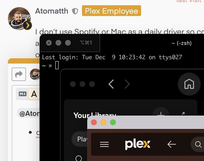
@Atomatth thanks for looking into this. So here’s the screenshot with the light theme to explain the UX discrepancy:
- the first dark window is iterm2 - perhaps the code could give some hints on what macOS APIs have to be used - GitHub - gnachman/iTerm2: iTerm2 is a terminal emulator for Mac OS X that does amazing things.
- the second dark window is Spotify - the whole app has seamless UX
- the third window is Plex desktop, where the top notch is of different color than the app background
Any chance of looking?