Collections looks like complete crap

I’ve tried not to complain about the new Roku app. It sucks, but we had Plex Retro.

Now Plex Retro is gone, and I can’t help but suffer through the new UI every time I watch something. So here come the complaints…

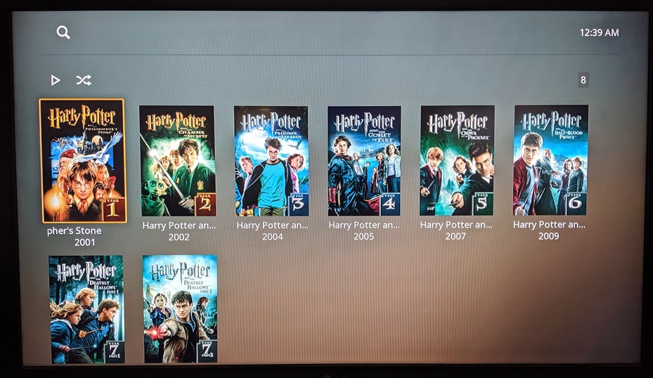
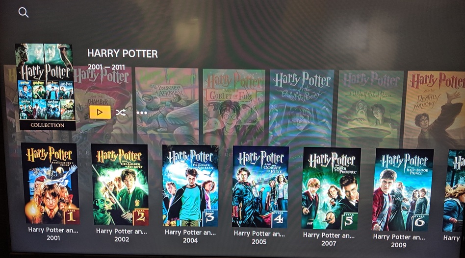
This one is about Collections.

  1. No Title

  2. No Description

  3. No Background

  4. Can’t read titles on the second row

1 Like

This is what it looks like on PS4 right now (which might mean it’s coming for Roku).

Regardless, this is what I had on the old app, and I what I expect from the new app.

This topic was automatically closed 90 days after the last reply. New replies are no longer allowed.