Plex has updated the Plex Roku Preview featuring new and improved navigation and @PlexInfo has asked us to “use it for a few days (ideally a full week), and share your thoughts once you’ve had a chance to settle in. The first few hours might feel different, that’s normal, but we think you’ll quickly feel how much faster and smoother it is than before.”
Yes, Plex asked for a week to review, but my initial opinion is that this is not ‘“the best of both worlds”
I see this as a mish-mash and I will test it and add my comments here, but my initial view is that this as mistake and that they should stick with ther Current Roku for Plex navigation.
Very good point. I use the New Experience Preview on a Apple TV and I don’t see what all the fuss is about. My wife a Computer Illiterate has no issue with daily use.
To compare would certainly help with understanding.
30+ years of UI layout has categories on the left. The categories are still a drop down, now a nested drop down. It’s gross and stupid and whoever designed this must be the nepo kid of someone and the parent just doesn’t want to tell them it sucks.
@PlexInfo , been a day, and while I still don’t like the new UI in the new Roku Plex Preview (I got used to the New Experience UI in the Roku Plex App, and the old Roku Preview before that), I can eventually get used to the new Navigation Experience . In reality, I usually just load one of my Continue Watching Shows/Movies on the Home Screen, so I don’t even touch the new Navigation Experience and when I do, it takes me about a second to get a new Show/Movie running.
I think this new navigation will help folks with more than 3 libraries or who navigate\browse their Library frequently. I’m like you and mostly stay on my Home Screen and Continue Watching so navigation was mostly fine for me but I do think getting to those library sub-screens via this menu compared to the v8 left side navigation after going to a library is less janky this way - though the UI could use some tweaking to just look a little nicer (maybe just a small bit of blur transparency or follow the theme colors a bit).
After being away from Plex for the last few weeks, I switched over to Emby, I came back to see if Plex had done anything to correct the fiasco they created with their new Roku UI. I found this new preview app. I installed it in on my roku player and played around with it for a while. In what universe is this an improvement??
still unable to keep my favorited libraries saved its been like a month this is getting really old and annoying to have to navigate to libraries instead of being able to see things on my home page
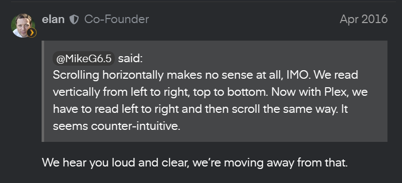
Have they learned, taken the wisdom of their failures, and moved away from horizontal menu’s? No. No, they have not, and that’s despite it being TEN YEARS LATER.
I honestly could like this. Looks like it would give fairly quick access to All Libraries but at the same time focus on Movies and Shows like Plex wants to do.
I especially like Genres on top but not sure how Plex would make that work. But ideally if I’m searching for a genre, it would be great to show TV Shows and Movies that match. Because as a user, maybe I want to watch Horror, but not sure if I want to watch a movie or show/series, so give us both combined. For that matter, a cross-library view of Collections would be great as well - I know Emby does that (and assume Jellyfin as well).
Not sure what Explore would be used for though?
Sometimes I think Plex needs to bring in more ideas - I imagine their staff is fairly limited so they don’t get as much input as they should (although we certainly have provided a ton here in the forums!)
For me there are 2 big issues on Plex. First: genres section is burried in sub menus, while most of the time when I am searching for a movie/series I am in a mood for a certain genre. Infuse for me has the best solution for this, just a horizontal list right there in the home screen, but maybe it would be technically dificult to Plex team, so a quick access menu would help a lot. Second: they still can’t figure out how to make mixed content (movie/series) in the many parts of the app, such as genres, playlists, collections, etc. There are some workarounds, but they are not good. To me, those 2 things are the most important UX problem they should fix.
If you have some legitimate criticism or feedback, we’re all ears (or eyes in the case of reading a forum post). I understand you have some strong feelings on the matter but calling out for someone’s job isn’t the way to get your point across here.
With all due respect, I’d get FIRED for being so inadequate at my job, especially now in the economy that we all must suffer in. Most of us have already given you and the exec team all the necessary feedback needed to fix these issues. The ones who are NOT listening and are not taking their own advice are those on the upper chain of command and we all know the Devs are at their mercy, just a cog in the wheel. Do not tell us to give feedback when there’s a pile high amount of action that can be taken already.
Edit: Double downing, triple and even quadruple downing on a HORIZONTAL menu, which had been well fought over in 2016 and again in 2025, nearing 2026… TEN YEARS LATER is not PROGRESS.
Really really don’t like it. Much more difficult to navigate. Search is my go-to now where before it was pretty effortless to find what I wanted. Just inexcusably bad.