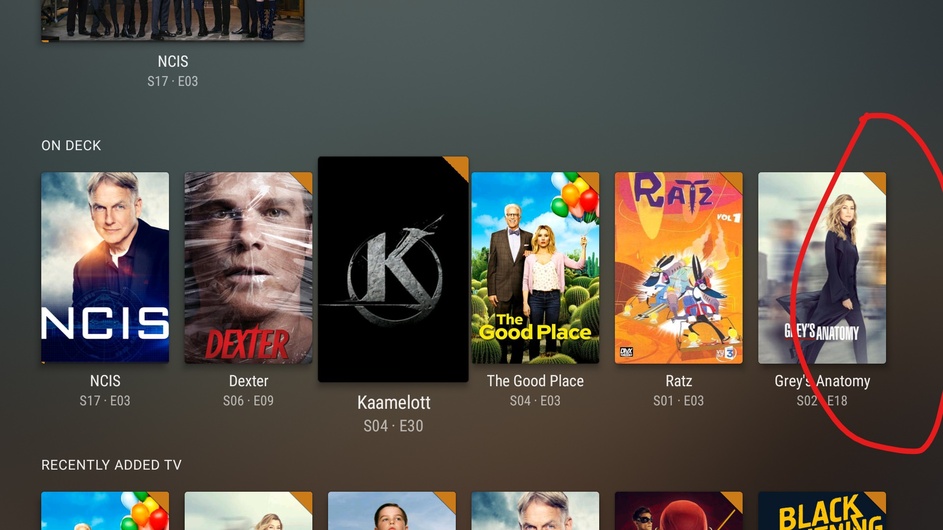
When I look at the On Deck hub on my home view (but works for any hub AFAIK) the UI let me think that there’s only 6 items when in fact there’s a lot more.
In my opinion it should show half of the next cover (The Flash) in order to show to the user that there’s more available on the right, as any modern UI would.