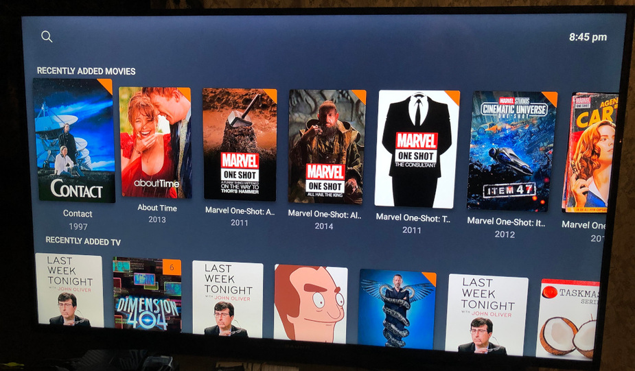
It just looks weird to me how there are two rows of poster images, and they almost fit on screen but don’t. I can’t see the words below the lower row, and when I go down to the lower row, the upper row is only half on screen
If this is intentional I guess that’s OK but it’s a weird choice. It looks to me as if Plex doesn’t understand the resolution of my TV (1080p, 16x9).
That looks like the Home Screen of the Plex app. This page shows a number of so called „hubs“, e.g. recently added content from your libraries.
Hubs scroll horizontally… so what you see as overrun is basically an indicator that there’s more content in this hub and you can further scroll to the right to see more of it.
By scrolling up/down you’ll be able to jump to the other hubs (or to the search if you’re scrolling up while on the topmost hub).
Thanks for your reply. I’m not complaining about content extending horizontally off screen to the right, however.
I’m saying I don’t know why I have one and a half rows visible in the vertical space available.
The second, lower row in my photo shows me about 60% of the poster—John Oliver down to his shoulders.
It may be designed that way on purpose. If both rows fitted in the space it would suggest that two rows is all there was, as there are no indicators like scrollbars in this interface.