Is navigation set or is Plex willing to make changes? When will the old app stop working?

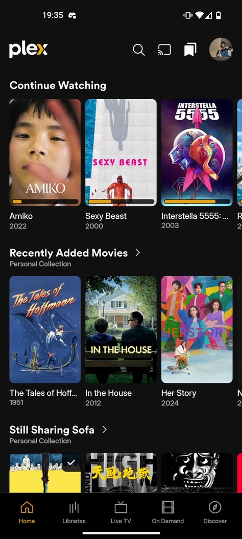
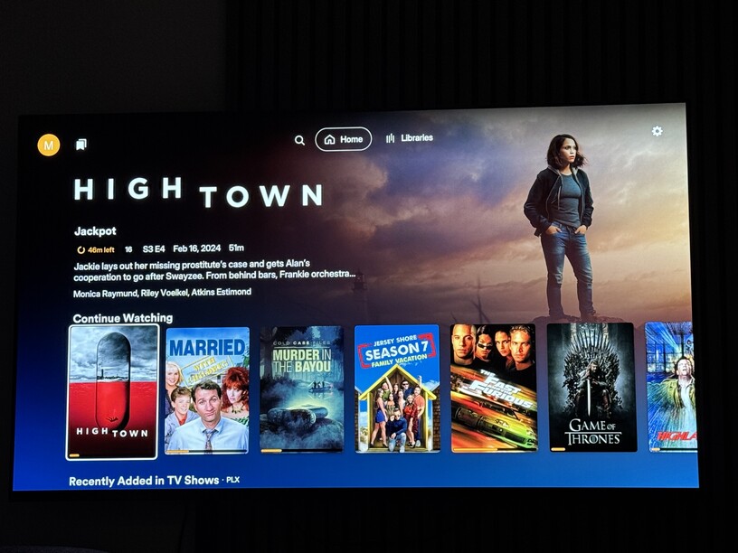
The navigation in the new app is a nightmare. It’s being designed for Plex content first and local content second. Shifting main navigation to the top of the screen (and sub-library navigation to the sides) leaves less room for content and makes navigating more difficult for non-tech users. Navigation to library sections has now been hidden under a sub-menu, meaning at a glance navigation is more difficult. The player is changing away from the native (in my case Apple TV) interface, for no good reason. We aren’t gaining features in the new player UI, it’s harder to find things because they aren’t labeled, relying only on icons (FWIW, this is why Apple designs their player UI this way… so people can use it without a map).

Is it worth making a post detailing this (screenshots), or is this current setup finalized?

When is the old app going to stop work?

I serve content to my parents and grandparents. They can barely get around the current app, the new app with its navigation changes is going to be a nightmare. I’d like to know these things so I start making alternative arrangements so they can still watch TV.

All these navigation issues are not worth having cool title graphics.

17 Likes

I’m in the same boat.

1 Like

Could you share some screenshots to show the specific problems with the user experience?

I haven’t been able to try the Apple TV version, but I’m using the Android trial version, and the changes I see are promising for me. This is my home page:

I don’t see the part where it’s noticeable that the interface is particularly focused on emphasizing titles already included in the platform over local content. In fact, these sections are usually customizable.

Obviously, the preliminary version for any device will be worse than the final version we currently use, in the sense that it doesn’t include many basic features and has performance issues. But we must evaluate this for what it is—a testing period where many things still need fixing. I’m not saying this is your case specifically, but I’ve seen people ranting on forums about it.

On the TV apps you no longer have your library sections on the left hand side of the main screen. Instead main navigation has moved to the top of the screen and local libraries is siloed into one menu item, Plex’s other content (Discovery, Live TV, etc.) get the other top navigation spots.

So to browse to your TV library, you first have to select “Libraries”, then select “TV” before getting to that section.

6 Likes

This is how it looks on Apple for me. Nothing of mine shows at all on the Home page in the Experience Preview App

He may be talking about the preview shown in this video:
Plex Previews New TV Interface

There’s some things I like about it. I get what OP is saying, too.

Edit: I think maybe the only thing I like better about it is the screen once you open a title and are looking at info about that title. The main title selection screen is a step down from the current state.

4 Likes

Discover, live tv and all that crap you can turn off for a much cleaner look.

Unfortunately the navigation still kinda sucks.

3 Likes

I see, maybe the possibility of directly pinning a specific library to the top would be a good solution.

I’ve read other users with the same problem, maybe this answer from the plex team will help you

1 Like

I already have all my server libraries pinned and added as favorites in the Preview App. And ordered like I wish to see them. But they never show on the Home page for me on opening the app.

I don’t use Plex for anything besides watching my own content from my own servers. I currently have all of their pushed / promoted content successfully hidden on Smart TVs and the current App. But if this is the way forward for Plex I’ll probably find another method to replace it. I paid for a server solution, not yet another streaming provider of free content that doesn’t interest me.

5 Likes

There seems to be a bug in the newest build of the mobile preview. I’ve had the same issue with my homepage as well. I directly responded to a dev on Reddit about it, their response was also to tell me to pin my libraries. Which was already done. They haven’t responded since I pointed that out.

1 Like

I agree 100% with the OP.

As a Plex Pass member for the past 10y, I have to say this new Preview navigation setup does not sit well with me at all.

The main horizontal navigation with a submenu of libraries (favorites) simply is using too much space and is forcing the user to click on the remote so much its annoying.

Also the list of “all” library items on the left hand side, the “browse” button is just ridiculous. So we basically got a replacement of what the current version has? What was left is now top and across, and vice versa but with more clicking? Why?

Also, moving from the horizontal navigation to the “browse” option on the left side does not work unless I am already in the body and selecting a specific item.

What I dislike the most is one more navigation element. opening a TV show for example we lose all extra navigation on the left and top side, so I have to use the “back” button in order to get one level back and from there jump somewhere else. Why? Hope this is a bug or something else but its ridiculous.

Also, where are the seasons for a TV show? Once I enter a particular season, again I have to go back to get to those before I can move into another season. Forgive me but that’s just poor thinking.

If possible, it would be great if this refactoring of a platform could allow users the freedom to manipulate the navigation and choose at least how it will work.

Or, change what needs to be changed, just leave the navigation and mini icons on the side alone. That top navigation with libraries submenu is a disaster, both on the mobile and especially on the ATV. So much clicking, way to much.

Finally, Siri/voice searching is missing, guessing this is still pending?

Overall, not impressed with the client, at this point, both with the organization element, navigation, and speed of it.

Please, consider all inputs as much as possible, I really don’t want to jump platforms considering I have zero needs for streaming/remote channels/content. Don’t forget the users base that uses your platform for local needs only!

11 Likes

Based on past “experiences” that Plex has rolled out, I’d say hoping for navigation changes to be implemented before release is a pipe dream. They very much pretend to want feedback but -in fact- they very much do not want feedback.

But hey…they may do it after (and a million people complain about it) but it’s status quo I’d bet. Even now, people from Plex are on the Reddit forums saying “no one complained about it!!” to people.

11 Likes

Holy … That’s disgusting! Its cumbersome enough in current version to navigate, this layout is a nightmare! unless you have touchscreen tv 30cm in front of you.
This downgrade better be 100% optional for ever.

3 Likes

I hate top nav. They tried this once before and it was a total fail. Odds favor they will force it out and wait to see what the reaction is. It’s what they do.

Lists of things naturally fall vertical. It’s horrible to put things in a horizontal list unless MAYBE your interface is vertical by default… like a phone.

4 Likes

Please stop changing things. Please. I’m begging here. Every single time you update the app a ton of things change for no reason and become a nightmare as we try to figure out what we were able to do by reflex alone just the day before.

The external content and aggregation is pointless. The “social” features are a waste of space and a total invasion of privacy. Moving UI elements around is pointless at best. Just maintain it please. Please. Please. Please. Stop changing things.

5 Likes

I’m looking forward for the Roku Preview Experience coming to Roku so I can offer my feedback as well.
Their is feature disparity between the different Plex players and while I do want feature parity, I don’t want to lose features that made me re-select Roku for my televisions…
Plex, please bring The Preview Experience to more devices so you can get a clearer picture if what ALL your users are wanting and needing.

1 Like

I’m not hopeful that it’ll be Roku friendly.

Top navigation on Roku doesn’t fit Roku apps. I like hitting “back” from almost anywhere to jump to my pinned sources navigation sidebar. I’ve used Plex a bit on other devices (Shield and AppleTV) and I think the Roku experience is the least fiddly in the current client.

I hope they follow the guidelines Roku posted for Roku Channel devs but it doesn’t look like it does.

That’s the significant downside to a single code base.

1 Like

The new Plex Experience app for Roku shouldn’t be very different than it is for other smart TVs and devices.

Like others have been saying on this Apple TV thread, it just needs to be practical for navigating from 10-20 feet away.

I also don’t want to loose the ability to screen it the cast of the movie or episode I’m watching without pausing or leaving the video to go back to the menu! :persevere:

And I’d also love for the UI to have at least 2 UI sizes - for bigger screens and another one for smaller screens - they’re is no need to limit a big screen TV to only showing 6.5 gargantuan posters on the screen when 8 or 10 would look more pleasing.

1 Like