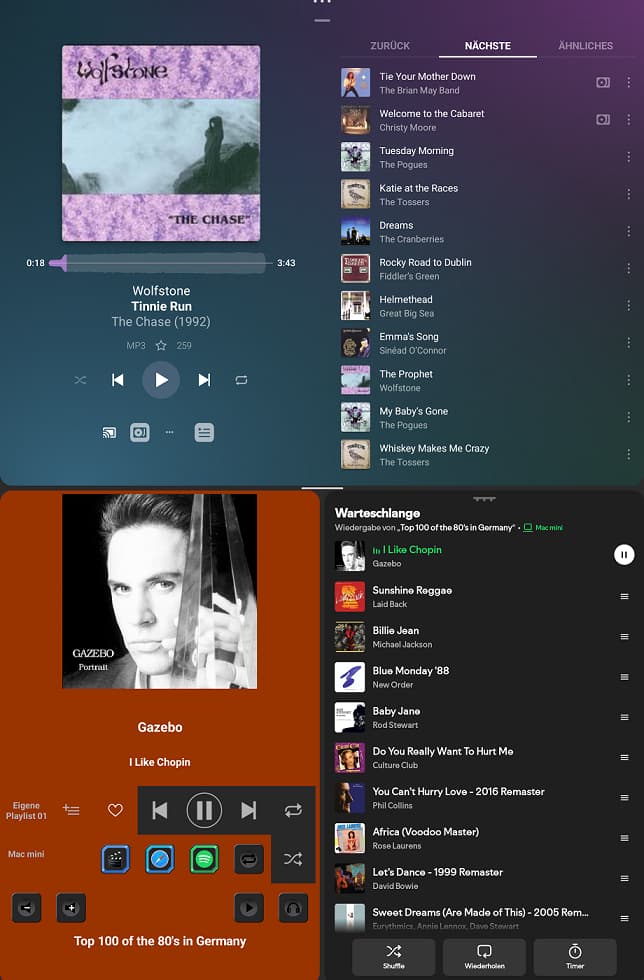
There is a new weird spacing above the main content of the now playing UI, that makes the UI as a whole odd and unpolished. My guess is some ux ‘expert’ said their is no visual clue that shows you can swipe down to get back and so they added the space and the small visual clue (and it’s only a clue).
My use case may be unusual? As my touch screen shows Plex as if it’s a living room streamer. …headless with a head… Think of any hi fi streamer you can buy, the screen looks simple and nicely places within the screen. Plexamp has always had a small unevenness around the album art but now it’s ridiculous…what gives?

This is my phone in landscape. Pixel Android 16. My android 15 tablet is worse. The album art is off the screen at the bottom on that.
Also the background extends full screen under the camera cutout but in landscape the background does not and this looks a bit sus.
Maybe a “full screen” setting could fix this?
Also for those using plexamp in the above use case. Would making the text displaying album , song, artist larger be a good thing? Yes…the answer is yes.