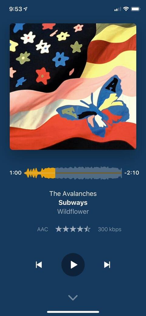
With the main Plex mobile app the album art is large and fills my screen. On Plexamp it’s a smaller square in the middle of the screen. What’s weird is if I use it in landscape mode the album art is bigger and fills out the area. I’ve spent a ton of time downloading high res art work and with a large phone I’d love to see it. Any chance you can add an option to use larger art work?
Mind sharing where you feel the album art is too small in the Plexamp user interface?
Or is this about the lock screen?! I cannot find a single screen where Plexamp is showing a small poster “in the middle of the screen” 


I suppose that’s mostly because Plexamp integrates the album art in a blurred version that’s filling the background. That will get lost if you fill the screen with the poster


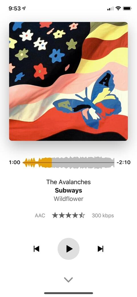
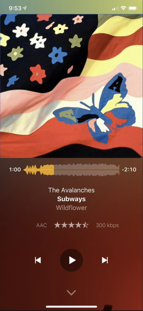
Edit: those are actually not so much examples for the blurring of 1 poster but how the different blur-levels will look on dark/light environments.
I don’t really see why the blurred background would be lost if you made the album art the same size as the regular Plex app? It looks like tons of background space would still exist for the blurred background. I mean, the app is still primarily about the music, so I don’t think we need to worry too much about 15%-20% less of the blurred background showing and 15%-20% more of the album cover art showing. It’s not like you’re making the albun cover art actually fill the entire screen, you’re just increasing the relative width and height margins of it or lowering the amount of “padding”.

I don’t even think it needs to fill the entire width, to be honest. I’d prefer it didn’t, actually. Literally just having it the same size as the default plex app would satisfy me, to be honest. That size is pretty much perfect for me. Using each of the apps for music, I actually find that the default plex app makes me phone’s screen seem bigger for some reason. Maybe it’s because all of the default app’s assets use up more of the screen real estate (in a good way).
While you don’t want to make everything look crowded or busy, I actually think that the Plexamp app is under-using the space that is available, currently. Like I mentioned previously, it’s actually making my screen seem smaller and thus more crowded than it is due to how its using the space it has available. At least that’s how it is on Android.

next release will make better use of space 
Yay! Thank you so much! It’s very appreciated!
Thanks for fixing it! 
thanks for remembering
The new size looks a lot nicer to my eyes! It now feels like the app is using as much of my screen space as possible while not feeling crowded. Thanks so much!
glad to hear!