Just curious from the Plex dev team if there are any plans to make the Browse Libraries buttons on the home page optional? Or perhaps it already is and I am missing something?
As of now it has really odd behaviours and personally I do not use it. I see that it might be useful for some but IMO an option to show/hide would be good.
For example,
Even if browse is the Default Library View settings option is Browse, clicking on one of the buttons (e.g. movies) will navigate the user to the library but it will be set to Recommended
The Browse button is highlighted but only the Recommended are shown
Clicking on the bottom right Libraries button in the home page to navigate does keep the library view as expected/as per the settings option (i.e. Browse)
With only recently added movies and shows on the home page, if there is nothing in the continue watching section of the home page, the buttons are in the middle of recently added movies and shows
Once something is in the continue watching, the buttons are below the continue watching section but above both the recently released movies and shows
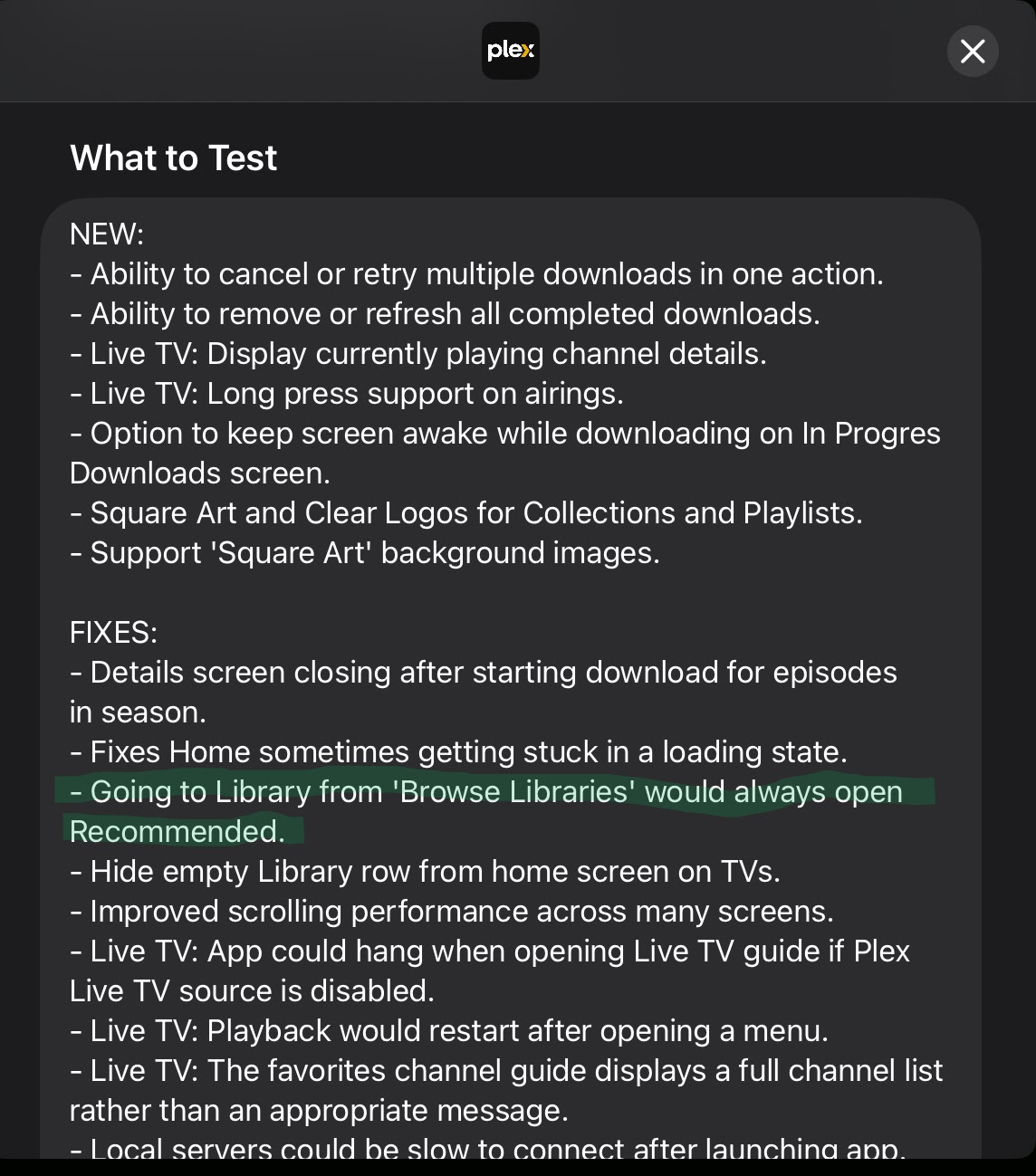
One small update is that in the recent beta (2025.30.0) they have fixed the browse libraries button to open the selected library in the correct navigation state.
Yeah I think that should be optional now. Originally that wasn’t there but people had such a difficult time finding their libraries that they added that. I think now that libraries are a bit easier to get to it could be eliminated. It really clutters up the Home screen.
I’ve been holding off upgrading the client until the dust settles… but have decided to test on one mobile device to see how things are going.
It’s nice to have bug fixes like the one mentioned above, but having “Browse Libraries” with all of my “Favorites” right under “Continue Watching” is an eye sore. It takes up a lot of screen space for no real value. There’s already a Libraries button at the bottom, and the Browse option is now fixed.
Can we remove Browse Libraries from the Home screen, pretty please? I really miss the old customization that the Home screen offered. Also, The Libraries icon doesn’t really do this app justice, compared to the incredibly useful slide over libraries side menu.. which i’m sure many people before me have suggested. Would be great to see this come back, instead of cluttering unnecessary icons on the home page bar. if they re-introduced the left side hamburger menu for libraries again, i wouldn’t even have any need for the bottom icons row… and would love to see an option to remove that entire, as well. let media in the libraries be first rate citizens on the home page… not all the cruft that users probably don’t care about and will never touch more than once, or perhaps the occasional accident.