Just discovered that selecting “resume” under the show icon just starts that season from the beginning of episode 1, no matter one’s progress.
1 Like
Okay, I’ve finally figured out one use for the new “Show” icon. It’s not necessarily worth the extra icon, but it is something that is now easier to do than without it. If you highlight the show icon, you can now quickly toggle ALL episodes between Watched and Unwatched. You had to do it by Season on the previous Roku Plex app.
I’ve also found the show thumbnail confusing/redundant… for me, selecting that does the exact same thing as selecting the thumbnail next to it, which is to play the current episode. Another annoyance is if I’ve decided to just mark the current show as watched, it marks the show as watched, including the ‘show’ icon, but if there’s another show already recorded, the next show’s thumbnail doesnt show up and if I select ‘show’ it seems to replay the current episode again from the beginning or in some cases it continues from a prior stop point. I need to actually exit that screen and then come back in to see the next episode. I much preferred when that screen was more of a browse, so I can also see other episodes that have been recorded already.
2 Likes
Me too. I’ve been tripping over this new first poster/show non-episode thingy for many days now. It is not intuitive. It should not be there. But, if it must remain, why is it a 16x9 thumbnail that looks just like every other episode? Make the icon a poster, or a thin, unique icon if it must remain.
1 Like
It doesn’t do anything but provide a placeholder for a couple season level controls.
There’s no reason they couldn’t just do the same thing using the overflow menu. That’s how the show level does it, so just put it on the over flow “mark season as watched” or “rate season” when at the season level detail screen. Having to navigate to the show\season card and then navigate the buttons below it can’t be fewer clicks than activating an overflow menu.
And for how infrequently people would use those controls it seems too intrusive for the more day to day activities.
Honestly I think it’s mostly for their online Plex TV service because they don’t have a show\season level set of controls there and need more graphical controls rather than menu options and this is a way to crowbar it in (the example the rep gave earlier for it’s usefulness was based on PlexTV web, not Roku). Roku was probably just a good place to initially set it up and test it.
I’ve gotten used to it mostly - less jarring now - but it’s still janky, slow to respond when switching between it and other episodes (actually all the episode switching has gotten laggy) and it’s unintuitive but at this point they likely won’t change it… not until it comes to AppleTV and Android and more people get annoyed by it but Plex has been pretty consistent about ignoring any UI\UX feedback (even in this beta where they asked for it).
1 Like
Okay… last time because I realized Plex already has the functionality for managing seasons already built in so choosing to use this card thing must have reasons beyond the ones stated.
We were told this card was needed for season level functions that weren’t available:
But y’all did have it already without using the weird card.
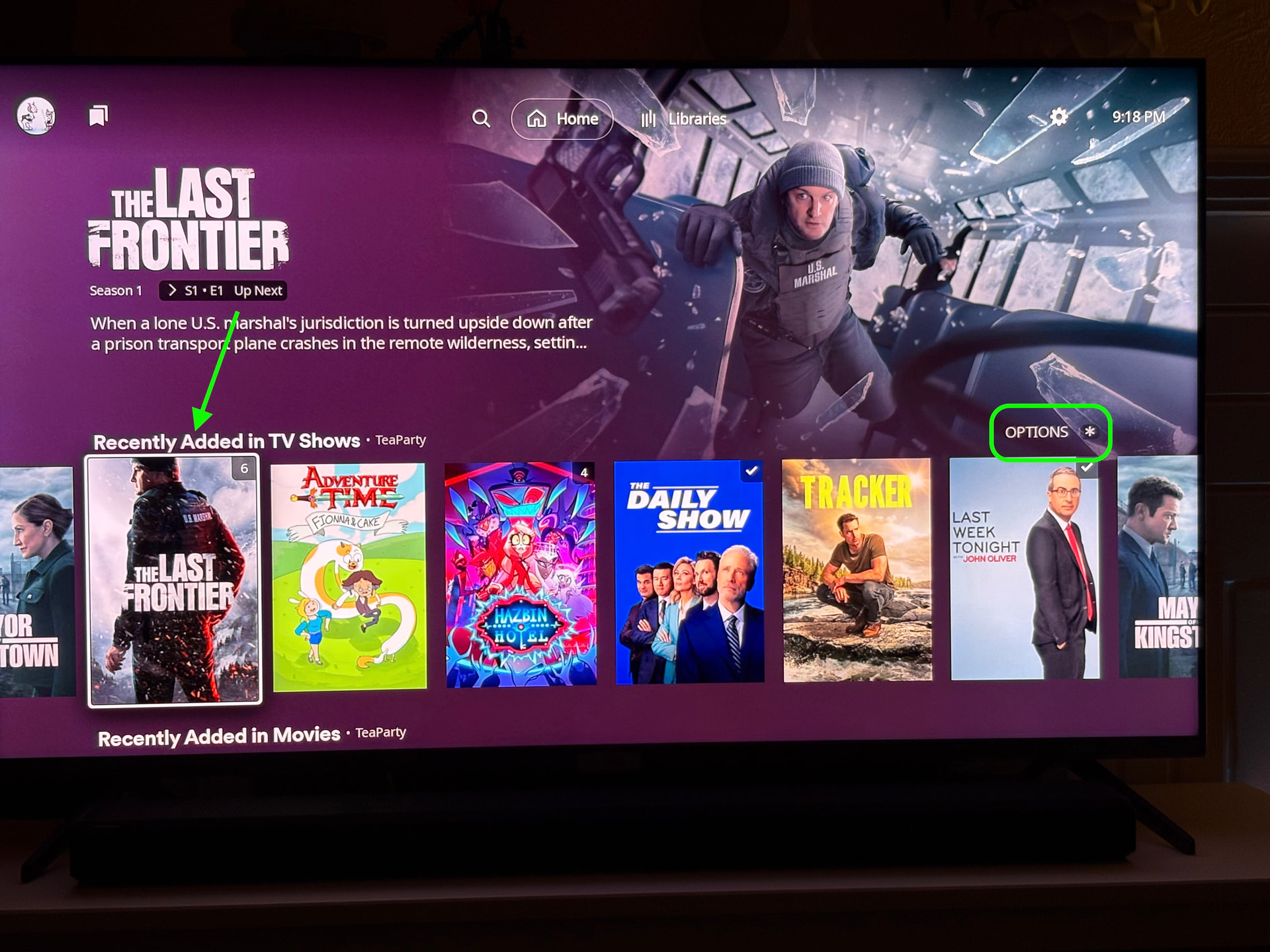
If I am on the Home Screen I can select a season poster from the Recently Added row and then click Options *:
I get this sidecar\overflow menu to manage the season level:
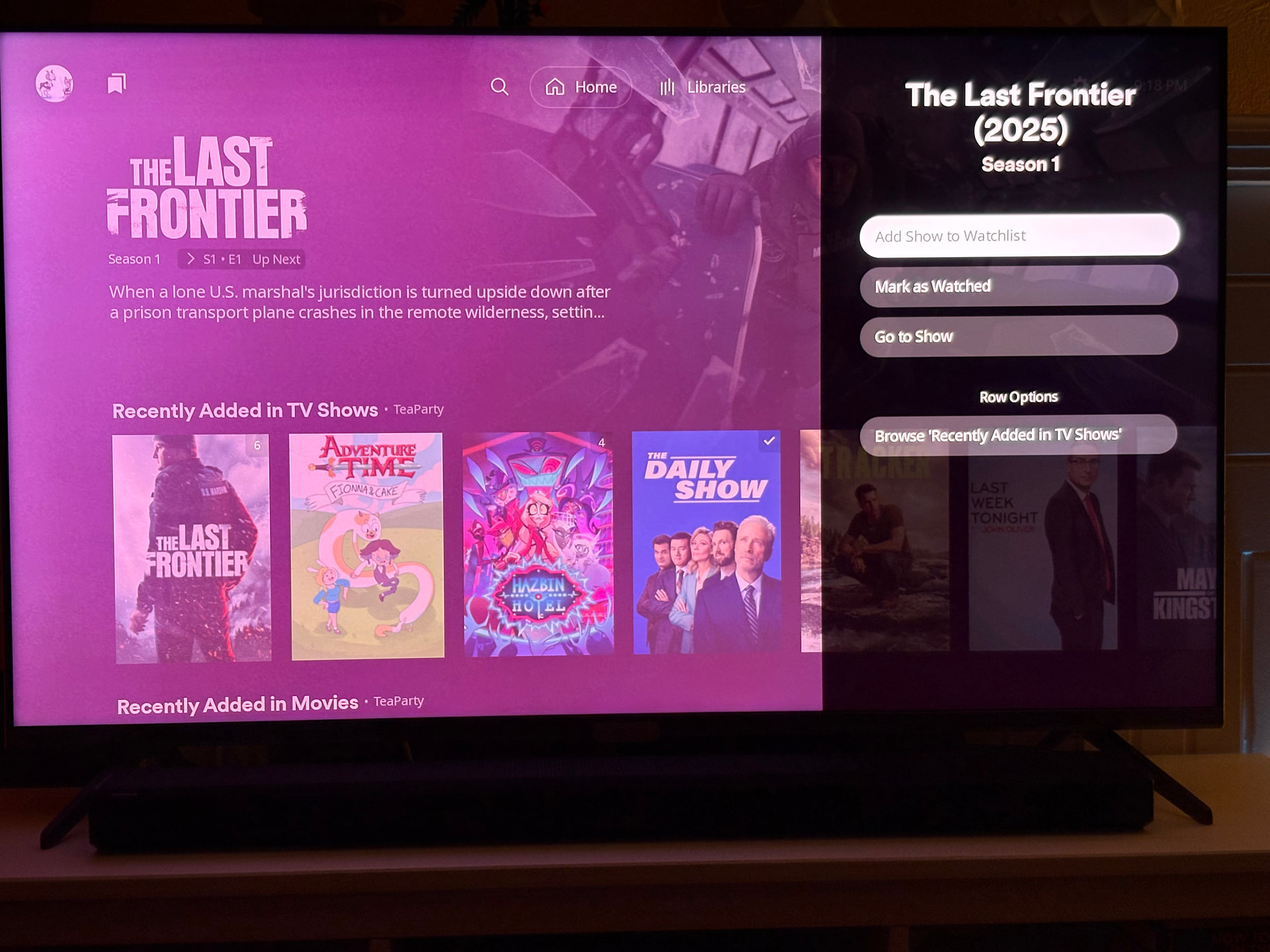
And there’s “mark as watched” and “add to watchlist” and room for any other season level actions. It’s already built into Plex on Roku without using this new card.
So just add that same Options * to the season row screen:

No new code or functionality to be done… y’all built it already, so use it.
Anyways that’s pretty much the end of making my case about this card being a crowbarred in weird “thing” (feel free to read my previous posts for that Ted Talk ![]() ). Reps aren’t being honest about it and won’t engage further (I’ve tried with other reps too and they’re dismissive despite ‘we wanna hear’ for everything else).
). Reps aren’t being honest about it and won’t engage further (I’ve tried with other reps too and they’re dismissive despite ‘we wanna hear’ for everything else).
I’ll let the AndroidTV and AppleTV folks make any future arguments when it rolls out to them but for me that card will continue to be janky and out of place and a constant reminder of a sore spot about Plex.
PS - please put the Show\Season top level navigation on single season shows too. There’s no reason not to have it there. Plus that episode card jacks up the “heirarchy” argument by being a Show level card instead of Season level card in those cases.
4 Likes
Its a pointless addition. Why not just allow that from the TV Show library screen? Or the Show listing where seasons are shown? That extra Season thumbnail within a season makes no sense.
3 Likes