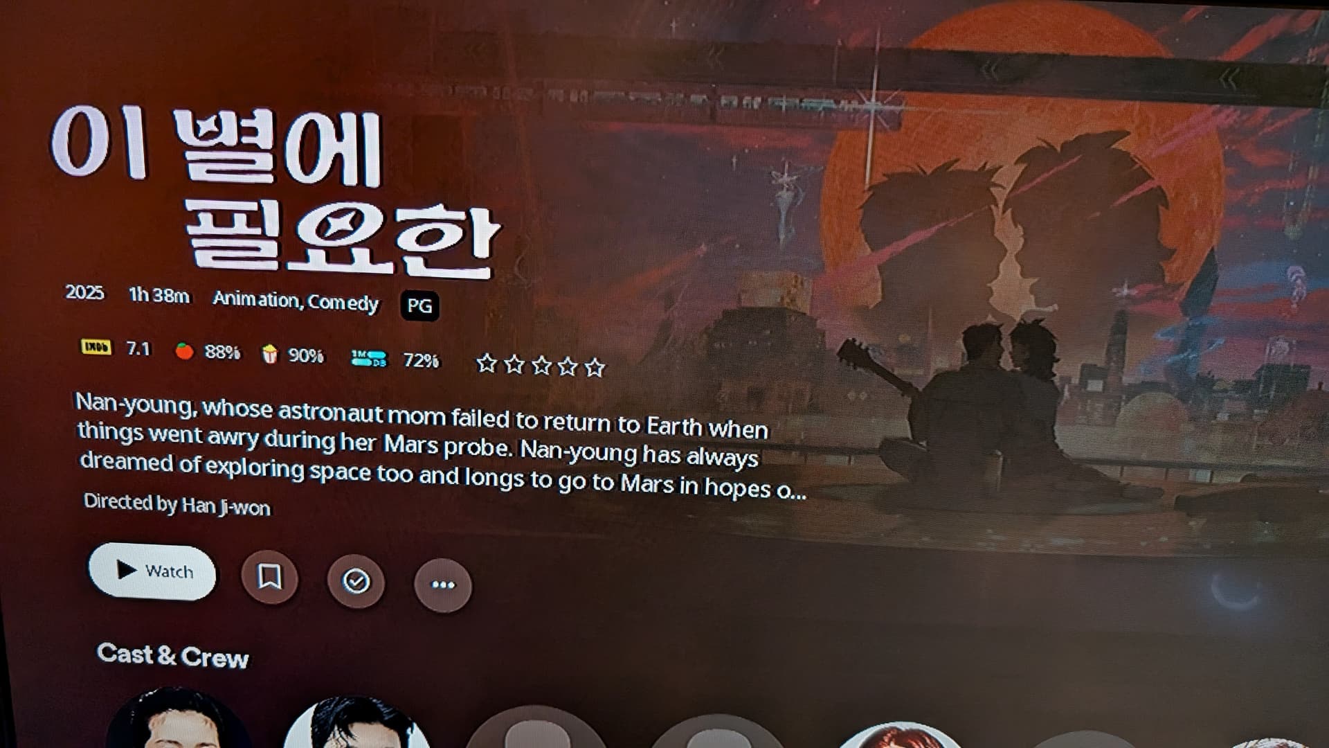
1- I do not want Forced Graphic Titles!! I want my movies or shows to display the titles I have in my server, showing that they are extended or director’s cuts! I want the titles to display the original title of the movie I have in my server and not a forced translation! I want the movie to display what i have in my server and not unreadable calligraphy!! Make this an option for people to turn OFF!!
2- Finding shows, movies or collections is a mess! So many nested options and odd locations!. This goes for ROKU, Android, PlexAmp, and others I have seen. Get rid of this mess and return to the intuitive menu of the previous UI, Please!
3- Lifetime members wanted Plex for the sake of an easy way to watch their movies and shows as well as a way to listen to their music. Go back to that! Focus on that purpose, please! You guys are turning Plex into a fragmented hot Mess!!
4-If unwilling to role UI back. Lifetime members should receive refunds. This is NOT what we paid for!
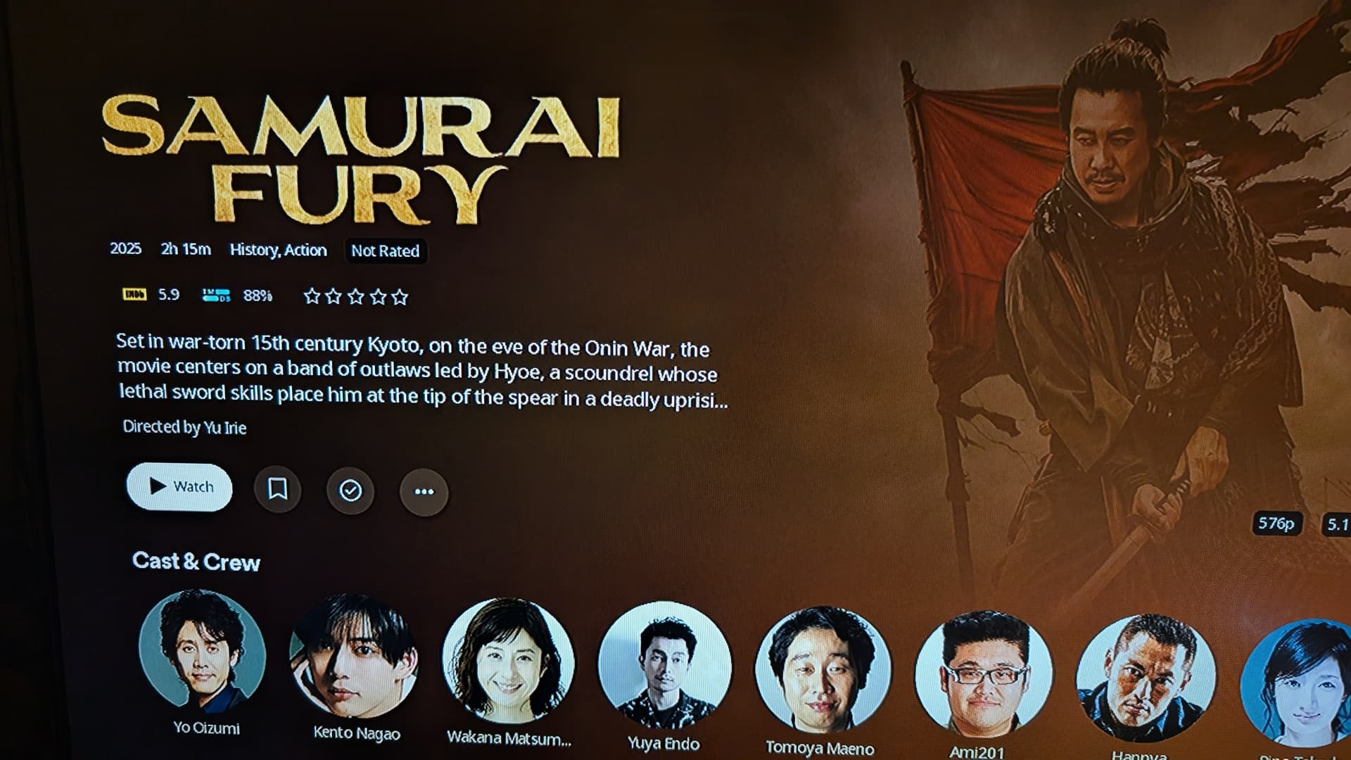
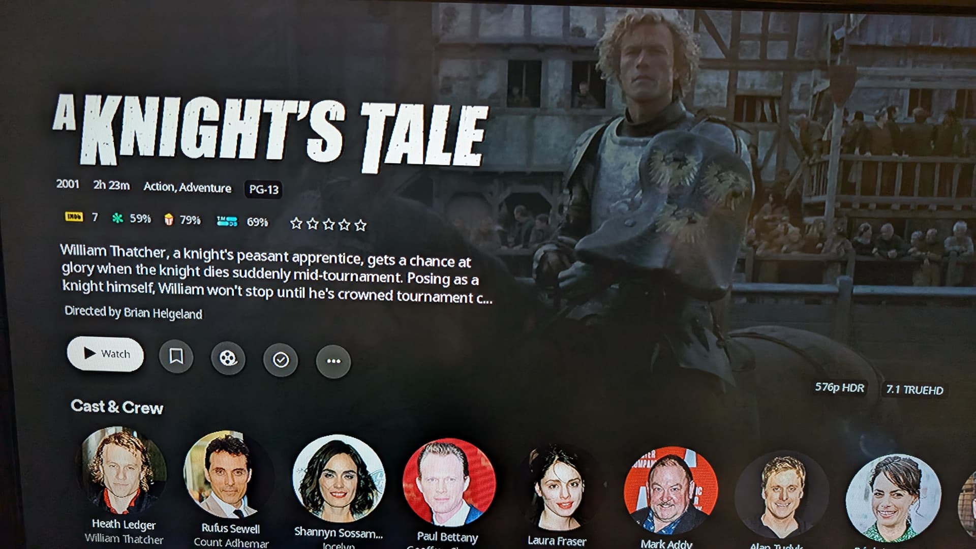
My biggest struggle with the title graphics is lack of visual consistency and lack of local control. Some movies/show have them, some don’t. Those that have them, they are MASSIVE (way too big on tablets and phones), and those that don’t just standard text. If PLEX wants to do something like this, we need the options to:
Use our own local assets for title graphics
or we need to option to turn the title graphics OFF
I love PLEX, but many of us are very detailed about how things are organized and appear, and adding more visuals with no local control is frustrating. We’ve already had the same frustration with Cast listings and awful Actor images for years (I get the copyright issues for the PLEX database, but not within our own private networks). I appreciate the logo concept, but not with it being unleashed upon us without any options to manage it locally.
Users should have local control on how these things are implemented. This and the overly busy menus are my big thing. I can’t disagree on any point here.
Usually people who PMS have that once a month . Now if you mean Plex Media Server, I don’t run the beta channel. But if it’s in beta can anyone provide any screenshots to what that looks like? I hope this function makes it to the stable release. The only thing left to fix is moving that horizontal menu back to the left and vertical again.
@Yaracuy That is very promising. Thanks for sharing this with the community. I hope that function makes it to the next update. Does anyone know if there is or will be a way to “unselect image” for your entire library and not just the individual movie?
I can’t find a global setting for disabling logos in a library. You should probably ask @drzoidberg33. He is the guy to go to for questions about logos and I think he’s done a brilliant job.
I was a little sceptical about logos at the beginning but I must admit, I’m beginning to like them. The secret here is to get the right logo with the right background art or square image.
@Yaracuy@BigWheel@Atomatth@dokuro Again, thanks for sharing, Yaracuy. I would be a bit skeptical too. It would be great to have a library wide option to opt-out of logos for a user’s media. But this is a great start to be able to select or even remove logos for movies. For me it’s more about some movies having different titles in different countries. Some people may prefer that international release. They may even have several versions of the same movie. Or Extended to Director’s Cuts with altered title names etc. (Scroll up to see screenshots of the initial post to see screenshots). There is a good chance there are not graphics for many of those. This would include Fan edits of films. Having the ability to display what a user has manually entered in the server removes that headache. Again, having the ability to edit logos and square art is a great start. I hope the auto populate logo issue can be addressed.
@dokuro Agreed. I have always appreciated the clean look. Especially when the poster you want will have a different logo graphic than what Plex has picked out for you or is even available. That ends up looking terrible. And that’s just to start…
@BigWheel@Atomatth Hopefully this does get address soon. A clean look gives users the ability to the titles of their director’s cuts, original foreign names of films, etc… Sometimes a clean look just works better. In the future there will be an opt-out option for an entire library. Doing this for individual movies would take up so much time. Would it be better as an opt-in option during setup? Anyone have thoughts on that?
That’s great but on a TV screen they just take up a load of space, forcing useful information off the bottom of the screen. That’s okay though, the new UI was clearly just made with touchscreen and mobile devices in mind.