Hi, I just tested the new interface with the Plex preview test drive on Apple TV and IOS. I see that now the bottom bar is full of icons that I don’t need (live tV, on demand, discover) and that the libraries are buried into a sub-level. Do you have plans to let use arrange this tool bar to access directly the sub section of the libraries like we can do now on the actual Plex app? Thanks

Where can you turn the online sources off?
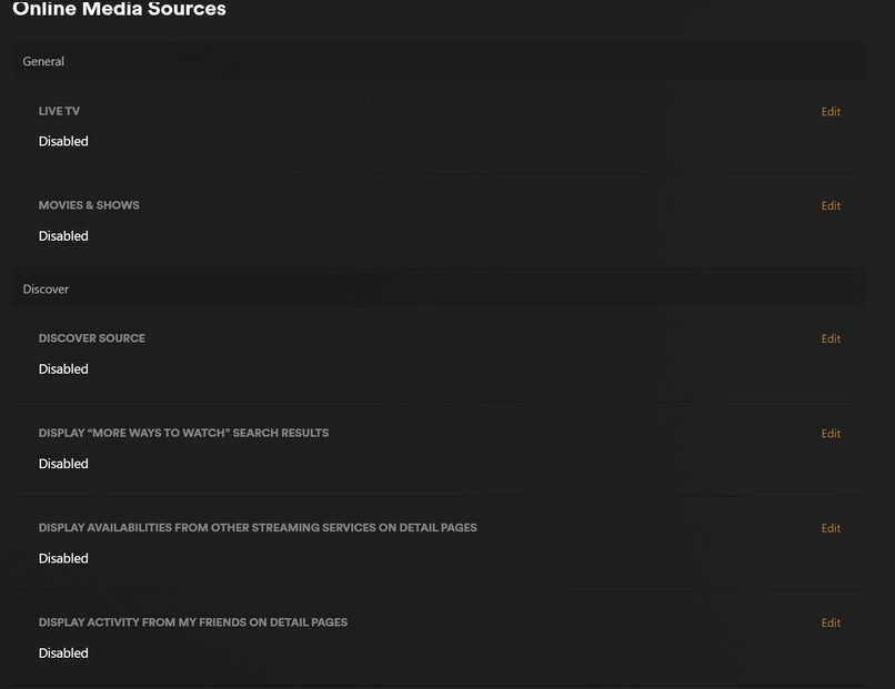
Go to this link:
https://app.plex.tv/desktop/#!/settings/online-media-sources
Disable Movies & Shows, Discover Source, and Live TV (if you don’t need/want it). Restart the client app.
Note: These settings are account-wide; they will affect all of your devices.
That still doesn’t remove it from the client app. I’m guessing Plex is going to keep that button in the app and if you don’t have anything enabled it will bring up a page showing all of the stuff you can get if you enabled it.
Just my guess but probably accurate lol.
It does work, I just tested it. Make sure you select “Disabled” and not just “Disabled for Managed Accounts.”
Try logging out and back in on the app.
Tried that - same issue. Even uninstalled the app and reinstalled and it still have Live TV showing. Interestingly enough, it did remember my favorite libraries though - must be storing that back on the Plex server.
Ah, I see. Yes, Live TV will remain as it is needed for those of us with OTA tuners (the traditional Live TV & DVR feature). But it does remove Plex’s Live TV sources (that’s why you’re getting a 404). That’s been reported in another thread I believe and hopefully something which will be addressed.
Sorry for the misunderstanding.
thanks, yes it does work. But I muss say that I’m really disappointed with the new interface, which forces me to go one level further to find the different categories in my library, because it considers that I need to access online content at the same level as my library. I think users should be able to choose to put their categories in the main menu bar at the bottom. I don’t care about “live tv”, and now, I have to search for hidden and inaccessible menus to go from one category to another. Try this on apple TV: scroll down in a long list of films, then try to switch to another category (e.g. TV series), it’s impossible without going back up the whole list of films. This new interface is an aberration.