hi,
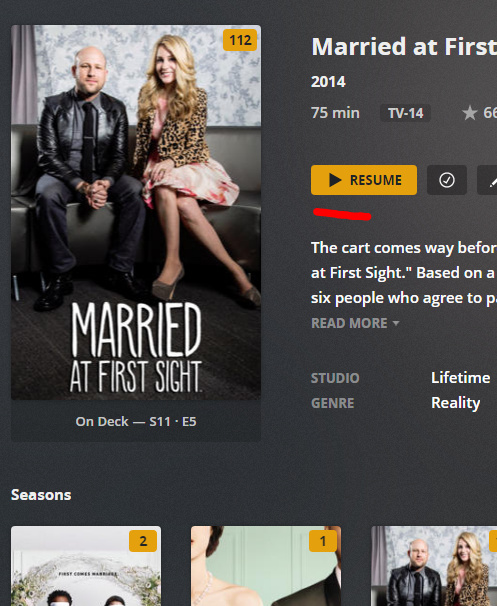
is there anyway to remove this play button on season covers? (see screenshot)
I realize you can click parts around the play button to access that season, but for new users and for general UX, the play button on covers is annoying and never intentionally used (in my experiences and feedback).
Clearly as a long time plex user, i know to click around the play button, but frequently i get questions from friends (using my server)- how do i get to the episodes of a season? (they say when they click it, i just starts playing the season).
(same goes for shows, where there is also the play button).
If you consider every other streaming service / streaming app- none operates like this.
If You click a season, it brings you to the episodes list for that season (then you play the ep you want / left off on).
If this is not a server-side option, it would be great if this was added.
Did you know that clicking the play icon of a season will also continue playing the last episode you didn’t complete or the next unwatched episode?
On most players, users can choose to click the poster to open the show/season or hit the play button to play it. In Plex Web you can click the play button on the poster or somewhere around it to open it.
Considering the button is changing its color when you hover over the poster vs. over the button itself, none of my parents have stumbled over this so far (maybe I got lucky with them).
Yes i was aware of this, however you do also get that option if you click outside of the play button (as you then get the resume option at the “seasons” level)
Or maybe then, at the seasons level have a larger play button on the large cover (now that you also have access to the seasons/eps at the bottom - this is the main issue, that is getting easy access to the seasons->episodes with the stock layout)
fwiw- while i do have a few older users (such as my parents), the majority of my users are 18-35 yo , so perhaps its that they are more used to using all kinds of streaming apps.
(bc i do agree! i have not heard this complaint from the few of my “older” 45+yo friends/shares)
I do still think removal/change for this should be an option (or otherwise give us some ability to remove it, in a way where updates wont break our modification).
I also, personally, think its an annoying gui element (early 30s).
thanks