One of the most annoying things for me currently is when editing a season description, it’s all double spaced! I don’t understand why this is a thing.. checked the database and it’s single spaced in there, it just seems to be the clients which display it double spaced. (See pic 1)
Apparently there’s no way to change this at all.
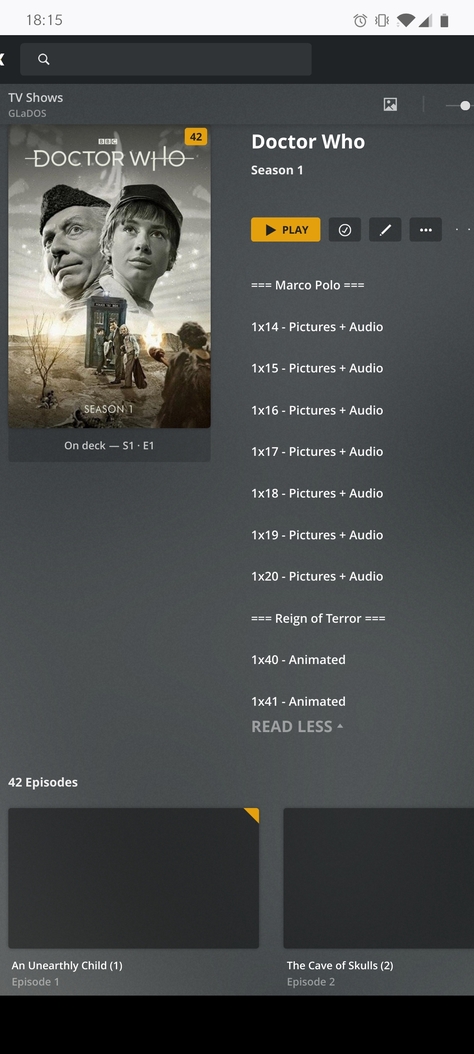
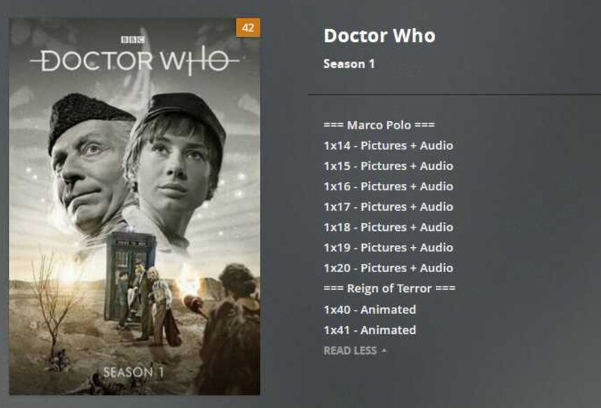
I’m trying to add a summary to show which episodes from which stories have missing episodes for classic who, and which have been animated (see pic 2), but there’s so much wasted space it’s infuriating. Especially with S3/4 which have a lot more missing episodes (see pic 3)
See related thread:
It can easily be fixed in css by changing the margin on .PrePlaySummary-summary to 0,0,0 instead of 0,0,25 (see pic 4)
I suppose this is particularly visible if you add single-line statements into your description – e.g. by using it to add a list of episode names.
The effect you describe is actually the margin between paragraphs.
Yeah that is true, it’s separate paragraph tags, but surely we should at least have the option to add a “soft enter” aka a line break within the paragraph?