[Edit 9/19/25] This should also apply to Roku and any other platform that is currently adopting the “top nav” solution. It has been widely criticized now by both mobile and roku users.
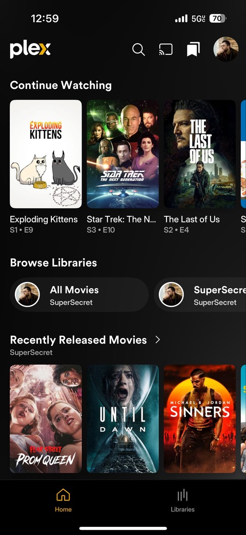
The “Browse Libraries” carousel is awkward to use, especially on a tablet. The chin at the bottom is redundant. Both take up far too much screen real estate than is necessary, especially given the increase in poster sizes.
Please remove them and return to the tried and true hamburger menu. Having a pop-out menu in this style would put all of your libraries on the left, easy to scroll and access and only two taps away in any given situation.
Screenshot added for context to illustrate how much screen is wasted on the carousel and chin.
That is correct, a return to the hamburger menu is what many users have been asking for so I figured I’d just start an official request. The hamburger menu is still being used for the settings menu, I see no reason why it wouldn’t make sense to have it for library selection.
Alternatively, an option to choose between the two layouts would work as well.
My apologies if tagging Apple TV was incorrect, I have not seen how the new experience looks there but I assume based on feedback it is similarly laid out. That tag could be removed if unnecessary.
Bring back the single click Left Hand Navigation Menu. The New Firestick UI with the top of screen left to right menu is beyond terrible and VERY frustrating to use. I just want the simple left hand side panel navigation menu that was VERY easy to use, both for the Live TV guide and my personal libraries. I am at a lost how this new version got approved for release. It is a UX nightmare.
From what I can tell it’s not just our household that prefers the left side menu over the top menu. It allows you to navigate in fewer clicks, and it is just nicer.
If you have to have a top menu, because of some specific device that I’m not using (we use the PC, TV, Phone, and Gaming Handheld systems, and left side menu is better on all those) - then keep it as an option, but allow for toggling back to the navigation system so many people have come to love on Plex over the years.
The whole issue with having a top navigation bar vs on the left is that you scroll up/down through your library. So if you want to switch libraries you need to go all the way back up to the top, whereas with the nav on the left you just scroll over a few columns and there you are.
Now if there was a guaranteed consistent option to get to your list of libraries without doing that, the change wouldn’t probably be as significant. It’s not nearly as bad on mobile since you can just long-press the libraries option which is always there on the bottom and switch.
I still don’t know how the Plex designers can’t figure that out!
Seems pretty simple and straightforward to just bring back the old nav style, the entire framework is already there and it would make so many users happy. There’s no need to reinvent the wheel to attempt to wow and impress people. We want a simple, easy to use interface. We don’t care about flashy new trends that are bad UX.
This highlights another issue that continues to plague Plex. “Secret” nav options. Press and hold, double tap here, back arrow there… most of the time these aren’t documented or taught to the users until the come here to complain and then Plex reps jump in like “well didn’t you know this secret code exists?” UX should be obvious and in your face, not hidden and secret.
Isn’t it ironic that while so many want to go back to the left margin style menu bar, something which is being resisted by Plex, that they updated the forum software to a new modern style that has… left margin navigation options.