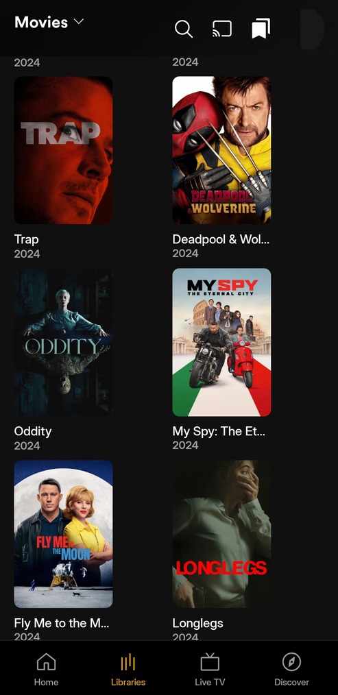
Please give us the option to customize the bottom nav bar. With the sidebar navigation gone it is more cumbersome to use the dropdown at the top left of the screen. Users like myself who don’t care for LiveTV/Discover/OnDemand could benefit by being able to add our Movie/TV libraries to the bottom navigation bar for quick access, otherwise I only have two options on the bottom bar with plenty of empty space.
Yes this is my biggest issue with the preview. I especially don’t like that I have to press the libraries button all the way at the bottom, followed by the drop-down menu all the way at the top.
I either need a second hand or an awkward grip to do both. Being able to pin certain libraries to the bottom, as well as move that drop-down to the bottom above the tabs, would be a big help.
Same with me. I want my content front and center by default, but with the secondary option of accessing Plex’s on-demand content elsewhere.
Once you tap the My Libraries icon to access the libraries tab you can tap it again to bring up your library list. There’s no need to tap the library drop-down at the top-left.
Oh this helps a lot, nice tip!
You guys are right
The tabs of the navigation bar (at the bottom of the UI) should be entirely customizable.
The user should be able to add a specific library there, maybe even a specific collection (one can dream).
That way, no user will complain about a specific layout, since they can customize it to their liking.
Funny thing is I remember them releasing something with similar navigation back maybe 5 or 6 years ago or so. The pushback was huge and they had to re-engineer the design to bring the sidebar back. Not sure why they thought they should go down this road again…
It was back around 2018…an example of just one of the many posts…
There are some screenshots still available which show the lower navigation
It appeared that due to a lot of the backlash, or perhaps there were other factors, eventually Plex redesigned their redesign which lead to the current UI and people were more or less happy with it.
Prime Video, Disney+ and Netflix apps all have the lower navigation in their mobile apps (along with horizontal scrolling which has always been a pain IMO). Not sure what focus group is telling Plex this is a good thing but to me the smart money would be to not only allow customization of the lower bar, as this post correctly suggests, but user options to either have the lower bar or the side navigation (or both).
Note: I have worked as a full stack developer most of my life and I can confidently say this would not be hard to implement, just potentially time consuming and more UI option panels.
This is no longer the case, you now HAVE to click at the top left to change Libraries. It was a nice option while it lasted though.
It’s been changed to a long-press now, at least on iOS. Maybe too many folks were accidentally double-tapping. Or they just wanted to try something different. Since it’s in preview (with active feature development) I’d expect further changes to all manner of things, particularly given the prodigious amount of feedback.
Can confirm a long-press works on Android as well.
I like the idea of using long-press for things like this. But for me on iOS, long-pressing the Library icon only works if I’ve already tapped on the icon to go to the Library screen. Once there you could tap on the top pull-down just as easily. It would be better if you could long-press on Library while on the Home Screen.
I would also like to see the bottom Navigation be customizable.
You should be able to get rid of the liveTV button and maybe add server favorites as distinct buttons.
That would already go a long way for me

