Can someone please summarise what Plex staff have said about the potential for upcoming updates for optimising their new GUI for TVs?
In particular there have been many dissatisfied comments made about the additional remote clicks needed to navigate around media servers.
There is no need to repeat there are plenty of threads (HERE, HERE, etc)
The key issue is that unlike many TV Video apps (like Netflix, YouTube) they have lost the use of the Left Hand navigation bar to jump categories.
This is a super important UX element.
Consider this user journey:
User is on the home screen and is randomly browsing the Recently added movies in a collection and is inspired to look in the main movie library.
In the old navigation journey, they could just go to the right and select their movie library.
In the new navigation, they have to scroll all the way to the top, then select libraries and then the movie library.
By just relying on the top bar, they have lost a key navigation tool and increased the effort of the user to navigate around Plex.
In short, I too find the new UX suboptimal and thus not ideal.
It is currently a case of style over substance and I welcome a return to good function, along with this newfound good form.
Not quite. In the new experience you press the “back” button on the remote and it takes you back to the navigation bar entry where you started. In your example, if you were on the home screen browsing recommendations and pressed back, it would take you back to “Home” in the nav bar. This is my experience at least, on both Apple TV and Roku.
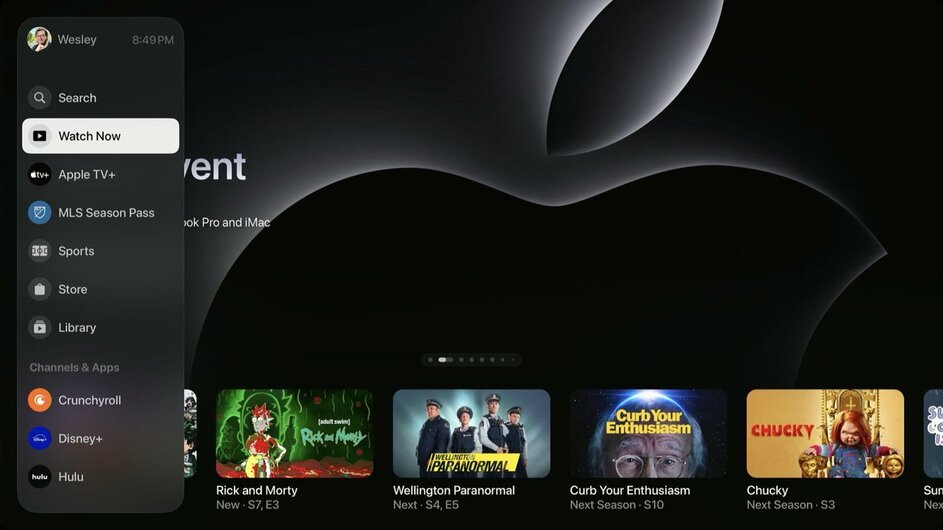
The horizontal top menu seemed to have been an AppleTV / AppleTV+ UI design, something that was previewed in Nov 2022 and it seemed to catch on to other platforms and guess what… when Apple unveiled it and officially launched the redesign, there were plenty of critical comments made about it when it made its debut.
Now it’s apparent more than ever that corporations are FORCIBLY pushing all of us into this horizontal menu direction.
Even NETFIX recently unveiled earlier this month their horizontal UI design, WITH a promotional video to go along with it too, almost in tandem with Plex. What the hell is wrong with a left sided menu? Why is it so hard to get them to understand that not everything needs to be all up in our faces. We sometimes want the curation to be that of our own and no one else’s.
LEAVE OUR LEFT MENU ALONE!!! PUT IT BACK!!! If not, KEEP BOTH menu’s and allow them to be customizable and auto hidden after a 10sec delay when not needed!!
If we the human species can launch ourselves into space multiple times a year, launch piloted drones as arsenal in times of militant combat, I’m sure a UI designer and coder can knock out some navigation menu’s that move in and out of view when appropriate in Plex’s New Experience. For the love of gawd and the holy, put the left menu back.