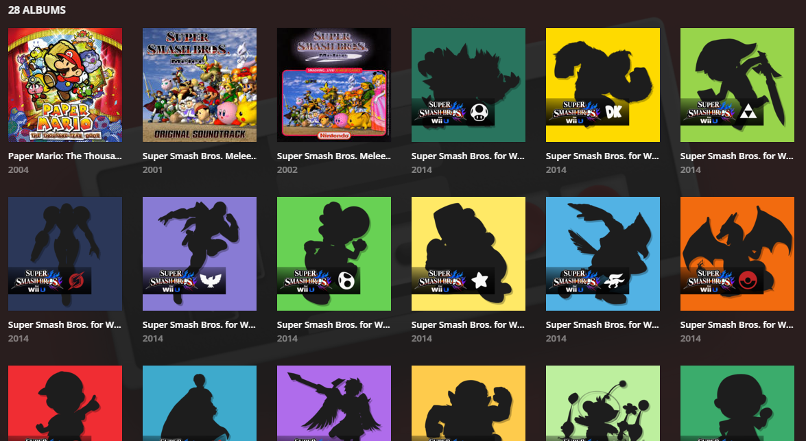
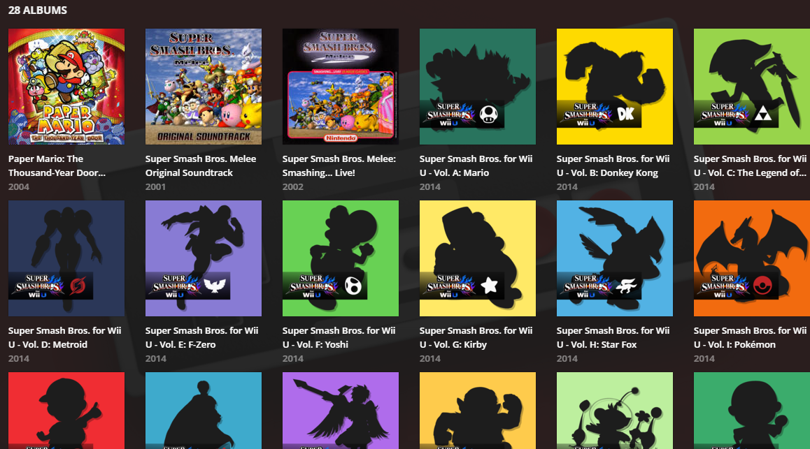
My Nintendo Music Library is annoyingly blinded by unnecessary truncation of album names. There is a whole line of free usable space between albums that is not being used. I had a friend use some unofficial Webkit CSS via stylish in order to show what this would look like, fixed.
Before
After
The amount of truncation used is ridiculous in plex currently, even cutting off actor names, instead of simply adding just one new line.
It doesn’t happen all that often in TV Show or movies, but when it does, it’s confusing as to why when there’s so much space on the page, there isn’t just an extra line used.
I agree completely. I would love to see the Stylish code that did this. I’ve taken a few stabs at it, but it’s difficult to identify the elements to change.
@beckfield said:``
I agree completely. I would love to see the Stylish code that did this. I’ve taken a few stabs at it, but it’s difficult to identify the elements to change.
.MetadataPosterTitle-title-1s2zc { height: 40px !important; white-space: normal !important; display: -webkit-box !important; -webkit-line-clamp: 2; -webkit-box-orient: vertical; }
Thanks! I’ll play with that. I notice it actually causes a problem if both the artist name and album name need two lines. Then things run over (or behind) the album below. But I think I can figure that out. I’ll post back if I do.
@beckfield said:
Thanks! I’ll play with that. I notice it actually causes a problem if both the artist name and album name need two lines. Then things run over (or behind) the album below. But I think I can figure that out. I’ll post back if I do.
Yeah, and on top of that, there seems to be no way to single out your music library within stylish via a url, it’ll have the be a userscript which can parse details about the page you’re on.