Could it be possible for Plexamp to not pick up too light colors for better contrast?
Or even better, bring back the beautiful blur that we had before?
It’s sad that you removed it, it use to work perfectly even on some of my old Android devices
Not happening any time soon. The blur component causes a huge number of crashes on Android, and breaks things like native scrolling, overscroll feedback, touch feedback, and some accessibility/assistance features. It might’ve seemed like it worked well, but I can promise you it did not.
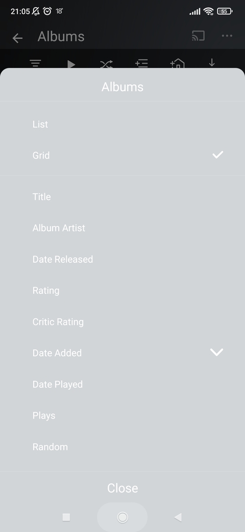
As for the screenshot above, what item was playing when you took this? It shouldn’t be possible, as we go out of our way to pick colours from the artwork with good contrast. I’ve never seen it looks this bad before.