+1
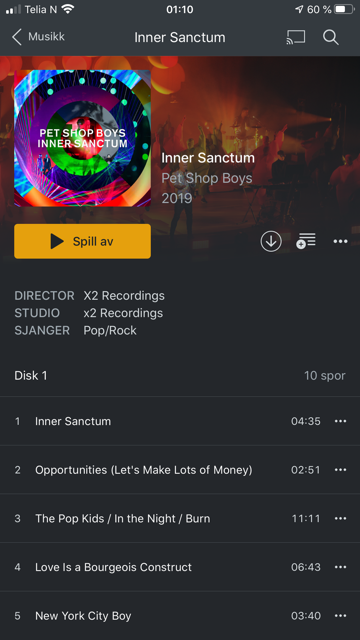
Director and writers are missing
IMDB ratings are missing WHY?!
absolutely meaningless and I cannot imagine what was the reason…? why was these feature eliminated?
In my opinion an upgrade should be contain improvements rather than setbacks.
I agree with all of this, the iPad version has been a bit frustrating, particularly for TV.
I appreciate the uniformity of movies and TV screens, however they still require specialisation for the different formats. Notably, the right empty space that is not populated with IMDB info is ripe for filling with missing features. I miss the single column TV but appreciate you’d like to move to more uniformity. So, this could include:
Reinstate navigate left/right for episodes and seasons. I often navigate through seasons finding an episode I like, and same with episodes. The top banner image was perfect for this in the older versions, but left/right buttons placed at the top of the in the empty right hand column space could suffice.
I miss the large image and play button. A top header for image/season swiping with large naviation buttons immediately below, and the two columns reduced to 50% of the screen might assist this.
Episode selection happens on the right, without a quickplay button on the thumbnail, and then a new page opens requiring moving to the left to push play. A few steps could be eliminated here:
Add quickplay buttons to thumbnails, or to the right of episode descriptions
Move the play buttons to the top of the 2nd column universally, so that they appear in line with cover image and episode statistics.
Overall the TV component needs customising for TV, reducing tap numbers and screens to browse and get to media faster. Looking forward to seeing what comes next
Director is back (ios beta 7.2), but now music albums also has a director field? It’s not affecting all albums though, only recently added albums (I think).