I’ve just downloaded the beta (7.1) onto my iPhone and iPad. I gotta admit I’m a little disappointed with the layout.
First the good. I love that the extras are getting a more prominent place in the screen. That’s definitely a huge plus. However, my main gripe is how squashed everything looks
Take this comparison as an example
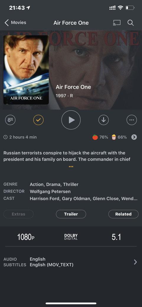
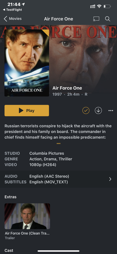
It doesn’t look very well spaced out and leans heavily to one side of the page. I feel like I’m looking at a web page rather than well designed app. The poster is larger than it needs to be. There’s no decent separation between the poster and the background. You’ve taken away the name of the director and included the name of the studio which is probably my biggest gripe and overall it just feels like you’re dumbing down the look to bring it in line with other players possibly.
May I suggest removing the studio and replacing it with the directors name. Graying out the background a bit more, changing the weight of the font or possibly decreasing it in size. Re adding movie ratings and the resolution and audio formats. How were you able to take all these things away and still make it look so squashed?
Other than that, great app as always. Can’t fault it’s functionality. Works great. Looks ugly. My personal opinion.