I am entirely aware this has been suggested before but all the other topics on it are closed and had little to no response from the Plex team. It appears that it was possible before but was disabled at some point.
While I can see how this might be some amount of effort on the Plex teams behalf, could you know write it in a way that it falls back to the default icons on a device that hasn’t implemented the feature and show the custom icons on devices that do?
I have 4 libraries that use the TV shows category, 2 that use other media, 2 that use music and 1 for movies. As such it becomes a little tedious to see what I’m actually looking at.
If you don’t want to allow custom icons could you at least add something like font awesome or some sort of font set that has a lot of custom icons to pick from that we can then choose from.
One of these is TV and one of them is Kids TV. Which one is which? I have no idea. Sure would be nice if I could give perhaps a visual difference between the two.
I agree, this would be wonderful.
Many of us use several of the same type of library for categorization’s sake, such as one “TV Shows” library for general TV content, and another for something specific, like anime; this, on top of the likely even more common situation of having other family member’s libraries pinned on the family TV etc, leaves your sidebar a navigational mess.
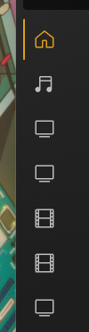
Like, none of that should be that unusual of a use case? But just look at this:
What!!
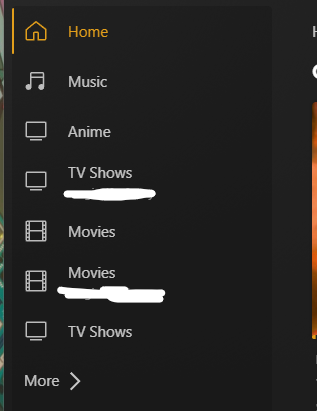
Unfolded, it looks like this:
True, one could do that, but isn’t your app supposed to look clean and organized? “Putting our media first”? That’s why y’all implemented the ability to collapse that menu down to the icons right, bc it feels cleaner to get them out of the way? One could open it and then close it after figuring out which library you need to click on, but doesn’t that sloppily take you out of the experience? What about on TV apps, where permanently expanding the sidebar isn’t even an option, iirc?
This would be cleanly resolved by implementing even a small handful of icons to choose from when setting up a library.
As a lifetime plex pass holder I came here to make my own suggestion for this just now.
Glad I’ve found it already exists.
Although over 2 years old I wonder what the chances of it happening are
I too would really like this feature, I have multiple Libraries that use the TV icon and Movie Icon, IE Anime and TV shows and Movies and UHD Movies. Please let us customize these icons or give more. I know you can expand the Hamburger menu, but I wouldn’t if I had these options.
How can something so simple and enable the application to be more intuitive be so difficult to implement?
The WHOLE POINT of a UI where you collapse the menu bar is to make is so you DON’T HAVE TO open the menu bar to see what you are clicking… without having to click it. I have never seen any other menu that works like Plex. If I always have to open the menu to decide then just get rid of it and just have the hamburger and i always have to open that.
I came here today to log a big list of small (easily implementable) ‘features’ that make a world of difference. I am so irritated that I am trying to find a replacement to Plex but find it is the best of the bunch.
Plex seems to follow the standard development though. Only develop new features (which I doubt many actually want/ask for) to try capture more users rather than fix/enhance existing features that users actually want.
It’s not a matter of difficulty but of priority, They don’t see it as one.
I remember how long it took them to implement to 2 factor authentication on accounts, which granted is difficult to implement, and that took him 3/4 years and a lot of nagging.
This exactly. I personally happen to like this idea quite a bit but right now we only have so many hours in a day and have some very exciting things that we working on right now. With that being said, this is a good idea and we will leave it open for additional comment. Keep the ideas coming!
The trouble with this is you are always chasing the next ‘exciting thing’ so nothing ever gets finished properly just left to languish.
I have worked (and still do both as a developer and product owner) in software development for 30 years (yes right back when token rings were alive) and have always, always, made time for ‘nice to haves’ as well as bug fixes and new features. It’s not popular with developers but it makes clients (esp. paying clients) feel valued.
One of the things often missed when developing is the build up of more and more minor irritations that users face, the micro aggressions that occur when using software. Ignore them and over time you end up with people having major issues with a product, when in reality it is just a hundred small tweaks here and there, that if solved as and when they arise (like 2 years ago in this case) and you would have much happier clients, rather than leave them to build up and then it becomes impossible to solve as it would take too long to complete them.
It would also be nice when creating new features you at least bring parity of functionality with existing features, ie, Plex Movies & Shows - no sorting when browsing, no filtering, no ability to instantly see what you have viewed or not (even though if you click into the movie you can see).
Its been years of people asking for this, how hard is it to implement it so that users can simply change an icon for their libraries? This doesn’t seem like a request for a drastic change.
Until they add a way to do this in the UI itself, it can be done manually. I did it a while back and am very happy with the results. Even created a few of my own icons to use. Just follow the directions at the following links. It's relatively easy to do, but it is a little tedious. But the end result looks great on my Roku's. :)