Server Version#: 1.15.4.919
Player Version#: 3.100.1
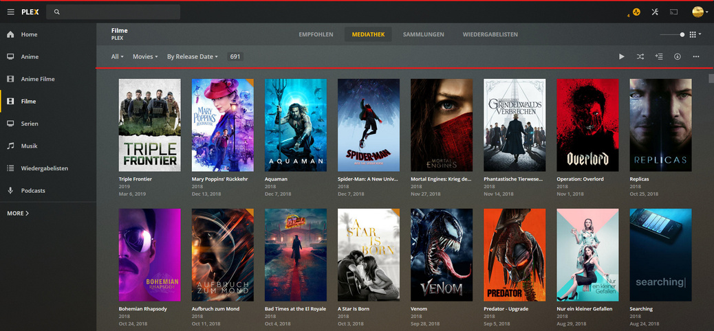
Good morning bois ![]()
some things I noticed at the first few minutes exploring the new UI:
-
The Menu disappears if the “MORE” Tab is opened:

-
One thing that was adopted is the disappearing scrollbar if the background is to light:
(I know it’s the old UI, but it’s the same in the new one)
-
All elements with this kind of dropdown have two types of popup animations, sometimes they just slide in and sometimes the bounce twice in the animation:
-
On large scale monitors the Resume Watching section gets really small compared to smaller window sizes:
And one opinion:
having three navbars feels kind of an overkill, especially if there is so much space in the top and bottom bar left.
I would recommend to get rid of one navbar like this, i think it’s a little bit cleaner:
