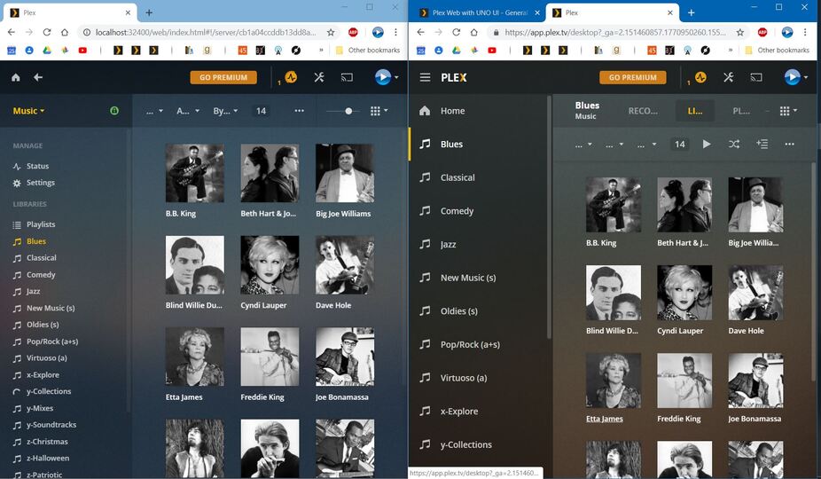
Please reduce the font size and relative spacing in the Side Bar Navigation Pane. It’s way too roomy for desktop use inside of a browser. You have it right in the existing version of the UI. No need to change it.
A side-by-side comparison of current (left) versus beta (right) is attached.
Double spacing doesn’t make sense for the desktop interface, regardless of the reasoning for it. It’s neither functional nor aesthetically pleasing.
Beyond that, the idea that it’s desirable to show content from multiple servers in the web interface is flawed. There’s a reason people run multiple servers. Combining content from them flies in the face of that reasoning. It maybe suitable for a player, but not for the interface that’s used to setup, configure and mange servers. The ability to select/switch between servers using a drop down menu is highly coveted and should be preserved.
What are talking about and why are you hijacking this thread? Stop replying to my posts with nonsensical, off-topic gibberish. There’s no “OP” here, dude.