Server Version#: Server 1.43
Player Version#: Roku v9
The new clearlogo feature is a nice cosmetic option but I’ve found a spot where the Roku interface doesn’t handle it well.
So, there’s generally going to be a no-win situation between mobile square display and TV wide display when it comes to these logos but I think mobile square display is more flexible of a layout and less impacted by which logos you choose (or are available to choose) compared to the TV displays so I think some re-jiggering of the TV display could help and I’ll try to lay it out with lots of examples.
Here’s TV display for Frieren using no logos first on a couple of screens (ignore the wilty plant, it’s recovering from not being moved before a cold snap).
Continue watching episode:

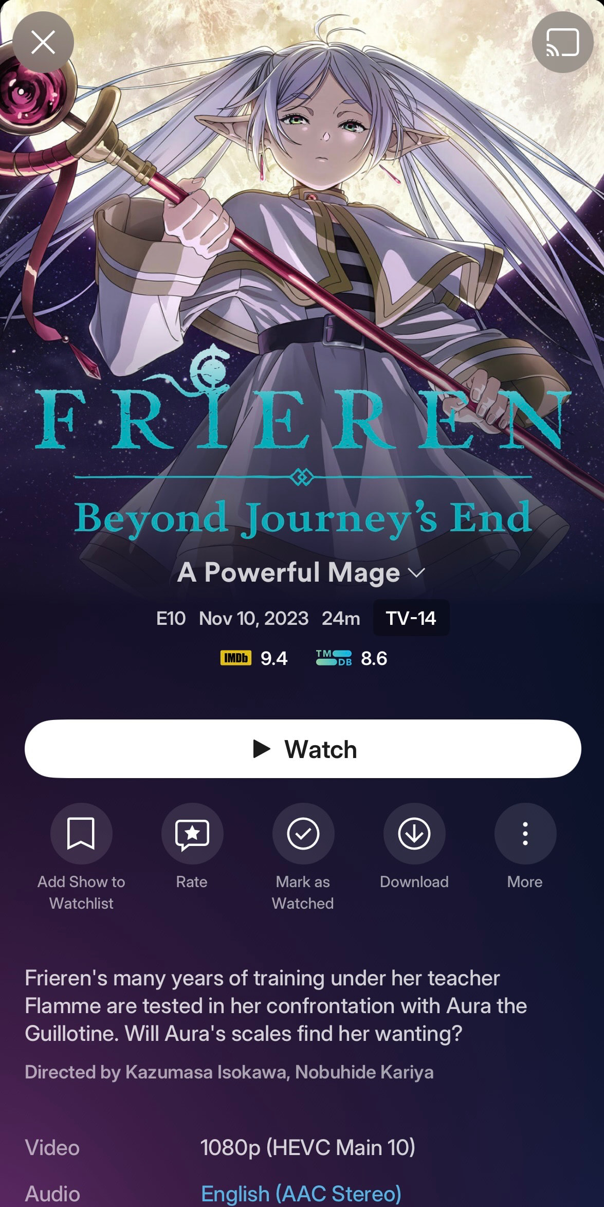
Episode Detail:

Show detail:

Here’s the same screens with the clear logo (all available clear logos are the same style for this show).
Continue Watching episode:

Episode Detail:

Show detail:

As you can see, the episode detail information scrunches that logo a lot and makes it very awkward on such a large display.
The show level is much better but still awkward because of that blank area above it - why can’t the logo be larger with all that empty space displayed, right? If you look at the text only shot too, it’s even more awkward looking with so much empty area above the title.
So it might help to add the Show\Season navigation row to the detail pages of shows that only have one season so the element placeholder constraint is visible instead of hidden. It’s less awkward looking on shows with multiple seasons and movies because that top of screen area isn’t empty. There’s really no reason not to have it there now that there is a “Show” option in that navigation so it provides a function even for single season shows and I think it’d be a more consistent experience if all TV details pages had it there. Just a suggestion… ![]()
Here’s the same logo vs text comparison on mobile just for reference.

Mobile handles square logos pretty well but the text can look awkward with the wrap (particularly for very long titles) … so folks will have to make a choice and have a little conflict. Before New Experience, mobile and TV were both similarly styled so it wasn’t as much of a contrast.
Here’s some other examples of “squished” TV logos.


You can kinda get how they feel less awkward having some top navigation showing in these examples too. ![]()
These square ratio logos just don’t work well for TV and “wide” options often aren’t available. In fact most logos are designed with a more square layout in mind. Plex is new to the clearlogo scene and the other platforms that use them lean towards more of that squared layout in their use so that’s what people tend to create. Maybe with Plex jumping in and using a more wide aspect ratio more logos will be created with that in mind now. Also, it’s not as easy of an element to create on your own compared to posters and backgrounds.
As comparison, here’s an example of TV episode with a wider clearlogo layout and it works fine.

Movies work okay even with squarer logos because there’s enough space to let them fit:


… and they don’t end up with a missing top navigation bar creating an additional gap above the logo.
There’s still some awkwardness because there’s that gap between background image and the detail\title. Maybe this is an area where letting that background image be a little bigger again might help? I know that was a back and forth (it used to scale bigger for detail pages and now it doesn’t).
I’ve mentioned it before that there’s a lot of padding between text details on screen and maybe this is another area where reducing some padding between the text boxes, or maybe layout adjustments, could help with the experience. I think if there was just a bit more height available on the episode detail display then the square-ish logos wouldn’t feel awkward.
For now I kinda just fiddle with the options and try to select wider clearlogos when available or switch to just text if it’s too annoying (that Last Frontier logo looks just awful - even worse if there’s a long episode title too). Or just live with it being awkward.
I’m glad turning it off clearlogos per title is an option and maybe it could be a per library option too? I could see defaulting to clearlogos off for TV shows and only using them for movies with this current situation.
I’m in “continue watching” more than anything in my day-to-day use of Plex so it’s really noticeable to me so I just wanted to mention it and include some thoughts on it in hopes maybe there was a way to sort it a bit. ![]()


