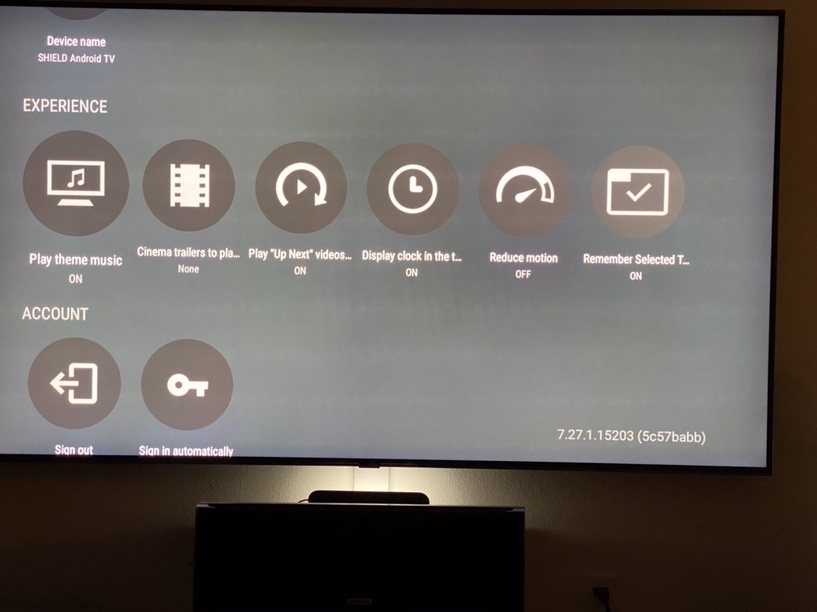
So I’m new to Shield with the Pro version and I have a silly question: What the heck is going on with the Settings menu? Why not a list like pretty much every other Plex version? Round icons with text cut off doesn’t scream quality UI. Any chance this is in the works or could be done?
Wow. Seriously? I guess this will fall on deaf ears then. Kind of boggles my mind that hasn’t gotten any attention over the years with their Uno initiative or whatever they called it.
You are correct, but then you’re asking the user to select every icon just so they can see the full text and only then really know if this is the setting you’re looking for. Scrolling text is fine for movie thumbnails since you have a pretty good idea what the movie is by the art.
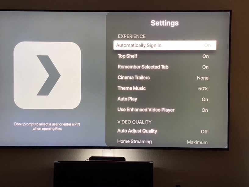
You tell me which of these settings menus looks cleaner and provides a better experience. And I’m pretty sure this can be done for Android Tv unless I’m totally missing something.
I really don’t mean to be an a$$ here. I was just kind of surprised to see this after being used iOS and Mac apps. Heck, if it wasn’t for an audio sync problem on the ATV4K I never would have bought a Shield. Now that I have it though and see how it handles audio flawlessly, I’ll be using this for Plex exclusively.