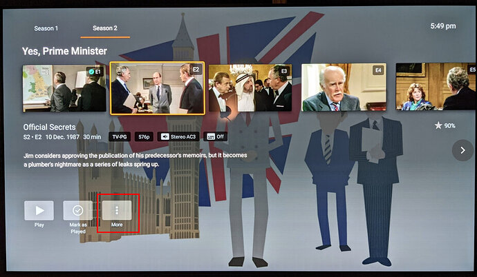
Currently on the 10 foot view (at least on Android TV), “go to show” is hidden by hind the “more” menu button:
It would make sense to make the “Show Title” selectable so you can access the “show view” more quickly and easily:
Given the title is already there, this shortcut wouldn’t take up any additional UI real estate, but would significantly improve UX for show/season switching.
Additionally, this would make the TV interface consistent with the web app (where you can click the show title to go to the show view).
In order to avoid adding an extra press to access the seasons row, it would be best if the show title were moved to the top. This way there would be no additional steps required to access the season row and thus no downside. For example:


