As the title says, the TV show navigation on the android mobile client is really clunky. I think that if it were designed similar to Kodi, it would be a lot more efficient. Meaning, there would be not only an ‘up folder structure’ back button like there is currently, but also a ‘home button’, which would take you back to library view, akin to how if you tap on the Kodi icon in their app, it takes you to the home page. I’m aware that tapping on the show title takes you to the show view, but it really isn’t helpful or obvious that it does that.
Isn’t that what you get when long-pressing the < button?
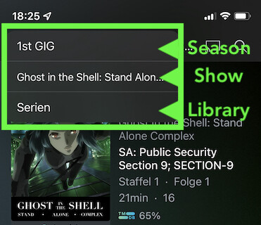
At least that’s how it works on the iOS client…

Android mobile 8.24.0.28408
Not the same on Android mobile.
The < button moves up one level per press. There is no long press.
If at the season or episode level, the vertical ellipsis has a “Go to show” option.

2 Likes
Can confirm, not on the Android client, though that would actually be nice
Agreed.