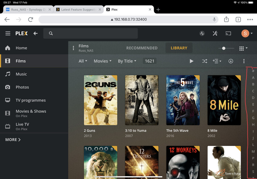
Having the selector bar on the right of the library means six addition clicks before you can search for what you have in mind. It doesn’t matter on mobile apps of course but where tv’s are concerned it is cumbersome.
The below image is from iPad and just for illustration purposes to show what I mean.