I’ve been bothered by this issue for a long time, but never asked because maybe it only happens to Korean clients and it’s hard to translate it into English.
I just waited to see if it would get fixed, but it didn’t, so I’m making a suggestion in the hope that it might get fixed if I raise the issue.
On the right sidebar of the Library screen in Plex, there’s a button to quickly skip through the list, but it looks very different on Android TV.
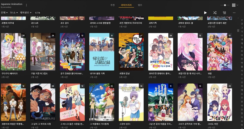
As you can see in the photo above, the PC client has all the buttons (A-Z in Korean) on one screen.

But on Android TV, it scrolls up to the size of the library, so if you have a library of 50 or so, you can hit the bottom shortcut button with a little bit of scrolling, but if you have a large library of 1700 or so, you’ll have hundreds of buttons, and you’ll have to scroll down for few minutes just to get to the bottom button.
Maybe there aren’t many people with large library collections like mine.
I would be very grateful if you could reconsider this and change the Android TV client to be like the PC client.