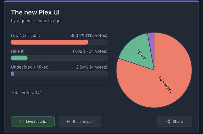
lol 90% of 114 users is nothing…
here is the link.. and it is valid and something lol. What is your point anyway? Go ahead and waste your time commenting about how something is nothing and ongoing isn’t valid or whatever brain mismatch may occur, meanwhile more and more people chime in.. and the poll results hasn’t changed one bit since it started, but you know.. not valid until it reaches 6 billion votes and is absolutely not a projection at 90%/10%… ![]()
A poll where only 103 respondents dislike the new UI is insignificant.
and after your post there is magically 8 more likes.. gee, ![]() so hard to detect someone grabbing every cell phone in the house and voting multiple times… sok, still will not change anything..
so hard to detect someone grabbing every cell phone in the house and voting multiple times… sok, still will not change anything..
I only voted once, but if that poll allows multiple votes from the same person using different devices, well, then that poll is invalid.
It only allows one response per IP address. Not perfect, but it’s something.
Then probably less than 100 respondents, and probably skewed towards dislike, In any event, the poll is flawed.
Lunchtime.. All polls are flawed, that’s common knowledge simply because you cannot get 100% of ALL opinions… but they are well known for providing SOME level of overall sentiment especially when exposed to a wide range of random people (internet).
If you’re trying to suggest that poll logic is flawed and therefore all results should be completely discounted, then what differentiates a poll that shows basically 85%/15% vs 50%/50% results? They are both equally invalid according to your arguments!?
Regardless, the point of the poll was to try and show PLEX (not us, we already knew…) that we are unhappy with the drastic UI design changes. We are trying to show Plex that there are LEGITIMATE USER INTERFACE ISSUES for SOME (actually many). We were trying to get their attention. There are accesibility issues (text cannot be read from a distance, major loss of intuity, confusion and inability to find media, difficulty for elderly and young children to USE the platform), there are screen formatting issues (text going off the screen), there is a clear trend of comments and feedback both constructive and pointles.. but both share passion of the consumer. This IS a big deal for SOME (many).
So..NONE of these points are directed to you or anyone else on this platform. This is for PLEX to take notice and hearing the voices of their customers. Everyone can share their opinion if they like or do not like the new UI.. for Plex to hear.
I AM happy to see that they have at least ackowledged and responded to the outcry but they still seem to be missing the key points..the removal of the left pane by nature is a major part of the accessibility issues. Like another user said, I should start writing my grocery list horizontally instead of vertically..they really need a LOT more BETA TESTING to flush out accessibility issues AND to accomodate both small and very large librarys. This UI was undercooked no matter how you slice it.
Lastly why not just give us the choice to use the old UI also? The work is already done.. if they cannot co-exist I’m fine with a “Legacy Download”..
How appropriate ![]()
I recently noticed that Trakt has also launched a completely redesigned Web UI. Compared with the old version, it has lost many features. Although it looks more modern and visually appealing, many functions are now missing or much harder to find.
I feel the situation is quite similar to the changes Plex has made. However, Trakt offers a toggle between the new and old interfaces, allowing users to freely choose whether to stick with the old version or switch to the new one. I understand that a website and an app are different — the old and new app versions are built on different frameworks, so switching between them isn’t as simple as with a website.
Still, if Plex insists on developing and improving the new UI, the better approach would be to allow both versions to coexist until the new one is fully refined and functionally complete. Users who prefer the old version should be able to keep using it, while those who like or are open to the new version can help improve it through feedback — until it becomes a mature product. Right now, it simply isn’t.
As many people have pointed out, this isn’t just a UI issue — it’s about the overall user experience and functional changes. The new Plex is also a major step backward in terms of multilingual support. The previous version supported dozens of languages. Even though some translations were incomplete, most users could still use it without problems. The new version, however, has reduced support to only around a dozen languages. While this may be temporary, releasing it in this state and replacing the old version has caused significant inconvenience to users whose languages are no longer supported.
It’s hard to understand Plex’s prioritization when such a basic issue as language support remains unresolved for so long. Many of the old translations already exist and could easily be adapted for the new interface — it’s not as if everything needs to be retranslated from scratch. Yet, after all this time, even this basic issue hasn’t been addressed, let alone more complex ones.
Fortunately, the new app currently only affects the mobile and some TV platforms, so the impact on me is limited. All my playback devices remain on the old version, and I don’t plan to upgrade — that’s my final compromise. I just don’t know how long this can last.
oopsie, I meant “sentiment“ lol
Children, Please agree on something… ![]()
I’ve doing the home media thing since XBMC on the OG X-Box and seen scores of variations of UI’s from many different developers. Never really complained about any of them. This last one for the ROKU is just no good and the outcry supports that assessment. If they can’t read the room on this an implement some simple toggle between “Classic” and the new UI, I have serious concerns for the company’s survival in the mid\long term.
I am encouraged that they “acknowledge” the dissatisfaction. Now, they need to do something about the dissatisfaction.
I like the new UI
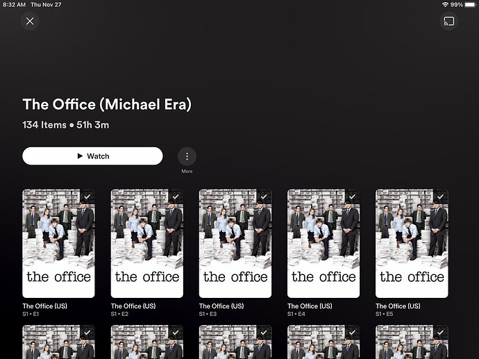
I’d like to share my biggest gripe with the iOS app. Let’s say you have a playlist with TV show episodes. Here’s what it looks like in the new/current app:
And here it is in the old app:
I don’t see how anyone could compare these two and see the current version as an improvement. Note how there are no episode-specific thumbnails and the episode’s name isn’t given. Am I supposed to tap into each episode to find the one I want?
The problem isn’t the developers. It’s the UX designers and product managers who worked this change out, and probably the businesspeople setting engagement-related priorities for an app overhaul - the source of all en**ification.
It has now


