Had a chance to review the recent Roku Preview changes, and I like them for the most part.
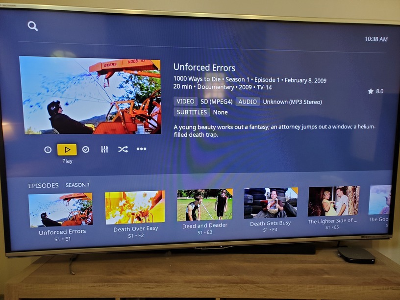
The only issue (preference) I found was with the indication whether or not an item had been previously played in several show views. I preferred having the orange “tab” appear in the upper right for items I have not yet viewed. It appears the new way it to show a play progress bar at the bottom of previously viewed items.
For me, I enjoyed the super quick way to determine whether or not I had viewed an item. The corner tab really stood out, whereas I feel the status bar at the bottom doesn’t really highlight as well.
Also, I find the tab to be incredibly Plex-esque, as in it was pretty much exclusive to Plex, and it’s environment. In browsing around, I’m finding that I miss it, as it was a part of the Plex personality.
It currently remains in the movie view. I’d like it back for individual show episodes for consistency.
The corner tab is still there for items that are un-started. The progress bar only appears for in-progress items. Personally, I think this is an improvement, as it provides more information.
In the Roku Preview App, if I hit:
Shows > Library > (pick a show) > (pick a season)
There are no orange corner tabs on individual episodes I have not yet watched.
Also, I just realized that all episodes that appear on the top are grey washed until I navigate up to them. That’s also a bit annoying.
Hadn’t noticed that till you pointed it out… Now I won’t think about anything else every time I have to do it… Thanks, buddy!
So, I like the look of the layout, even the progress bar… but I’m not having fun clicking around in it. It’s also interesting at the show level that the seasons are at the bottom, but once you get in, the episodes are at the top.
Would it make more sense for the navigation to start at the top, on the next episode in your lineup? Then you could navigate down to do further interactions for that episode if you so chose?
Ah, I was looking at movies. That’s not new to the preview. The current released version, 6.6.5, is the same way. I think it’s been that way for a while.
I’m not having fun crossing the median to do anything and I’m not having fun with all the extra clicks. Plex makes money every time we click something and when the transcoder is running… I don’t know how, but it’s the only thing I can come up with.
So, if you loaded into that screen, and the highlight was on the next episode in line that you hadn’t yet viewed, would that solve having less clicks? You could then just go left or right in line with the episodes to get to the one you want, up to switch seasons, and down to get to more info?
Down Twice for More Info - then Up Twice to get back to the Episodes.
It’s like a Jack LaLanne Workout Video for Fat Housewives…
“over the info step up high ladies, breathe in, breathe out, FART! Yea… that’s the ticket!”
I liked the Orange Wedge until it covered up something on the poster…
I could ‘get used to’ the progress bar thingie, but my knees and hips won’t like climbing over a dead horse 100 times a day:
I liked the Orange Wedge too. They may not be covering up anything in the episode tiles anymore, but now the new episode numbers are. I also miss the episode titles that were displayed below the episode tiles. I wonder what the reasoning was for removing them?
What was broken with the old format, that warranted “fixing?”
I noticed the same thing about missing orange wedges.
I prefer the old way of showing info also, with bright white text (including resolution, rating, etc) on black background for easy reading. Not sure why they are changing it…doesn’t make sense.