I thought the dimming focused you in more on what you needed to know about the material you just clicked on. Like, it really drew your eyes to the text. Personal preference. Not a deal breaker.
Personally would like to see the video/audio info over by the text and not on top of the backdrop. I do like the way Emby does that as it has a dropdown so you can see/select the video/audio options before playing. (But I know, probably not the esthetic Plex wants).
You mean next to the director?
That is the “readability” I was talking about, however the dimming was impacting 1/4 of the screen not covered by text. There must be a way to allow a larger background yet not dim such a large area.
The more I compare the screenshots, the more drastic I’m noticing the background cutoffs in the new preview. It looks less…professional. There must be a better balance.
The zoom was a little short to be good, IMO. It wasn’t a bad effect, but the difference in size and short duration of the effect felt kinda unnecessary. If the “preview” size had been smaller it would have made more sense. But yeah, I recognized the reason the whole image was getting ultrablured over was to keep the synopsis text readable.
Sometimes I find text hard to read on pre-play screens on Jellyfin for the same reason – a busy background and not enough contrast.

I still preferred this as it definitely drew your eyes to the text. I think it looks better only on the details screen.
Ah, the left margin is smaller. Nice. Now if the top could be reduced to match…
They could fit 1-2 more lines of synopsis text in if they did that.
Does anyone else notice the lag in the new app? Especially when browsing episodes, the text and images take a second and while it happens the it’s not very responsive. Then if you try to mark an episode the response is delayed. The previous app didn’t have this problem… even this new app was released it wasn’t this bad.
Sorry, disagree. “Splash” (bigger), or impact, is the way to go for a modern streaming UI.
If modern streaming UIs and services were any good, we wouldn’t be here. Food for thought.
Thought taken, good point. ![]()
![]()
However, I’m also here for a replacement but remaining appealing. I started with Plex to protect my kids from commercials and protect my discs from my kids. It’s grown in part into protecting myself from commercials. Saw on a recent NFL game, “These are my breasts.” With a continuous camera shot of her mostly clothed breasts, but not entirely, for most of the commercial. I really don’t need to be watching that to “pay” for my viewership time.
Plex, without Discovery, has been a very decent replacement from most every streaming service.
The latest v9 should fix that… at least the lag when browsing. It was previously loading summaries at the same time as cast which slowed it down but in v9.0.29 it loads summary separately which kicks in faster now. It was a major irritation for me so I notice it being fixed. ![]()
I really wish they’d compress some of the “comfortable” spacing to “cozy” spacing. On Home and on TV episodes it’s only 2 lines. NewExp Feedback: Display More Summary Info
I actually liked the zoom on background image when going to details, just not the color overlay being a bit too opaque. I’ll live either way. ![]()
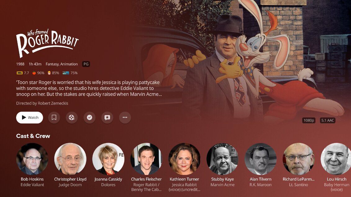
The problem with the zoom is it really cuts into the background itself. I already have to adjust my background choice from time to time because of the 15-20% loss from the fade on the legacy interface, now look at this one: In Kilgry’s Roger Rabbit example Jessica’s completely covered in the zoomed look (but we get a nice view of those crates behind Roger and Eddie).
That’s a good point about seeing the background and accounting for it.
In the old Roku app it always cut off the right side so I picked images that worked better with that issue… and now it’s right justified so you might lose a little on the left now.
There’s not gonna be an answer that makes everyone happy of course … maybe an option? Let users pick Zoom or No Zoom? Used to have more theme controls previously so this could be one they add in to feel like we can personalize it.
I’m not sure how this relates to my comment. The margins can be smaller even if the background is zoomed. My complaint is with the excessive deadspace on the left and top edge of the layout. In fact, even when there was a bunch of icons on the left edge the margin was not this big:

But the top is the same as the old layout:

The new revised layout removes the excessive left margin. It’s even smaller than the old interface (which makes sense if there’s no source list now):

Just need the top to follow suit.
I’ve been farting around on the Xbox doing some file experimentation and it really makes me nostalgic for the interface we had, and the nitpicking that we weren’t doing. ![]()
Yeah I think it kind of gets lost there over on the right and should be with the rest of the details on the left.
Thanks for the acknowledgement.