I just did a search for the word snake searching for Snakes on a Plane (2006) - IMDb . The drop down returned 30 results I had to scroll thru. The old UI of returning a search result page with them listed in the gallery/same format as browsing movie posters was far easier than trying to squint and read the small text/image of the drop down.
Try a search for someone who is an artist, and and an actor in both movies and tv.
I just tried “John Lennon”. With new search, I get a long list, that defaults to the “Artist” option. Hitting more brings up a long list of music tracks, but nowhere is there a choice as an actor for a TV show or Movie he is in.
Selecting the “Actor” option brings up a secondary window to choose the source. In my case, that’s two movie libraries and one TV library. Selecting one of the libraries only shows results from that particular library.
The old version takes you to a search results page, Movies from both libraries are shown in one section, so I don’t need to do another search in the other libraries, and I can also see the other categories - artist, tracks, albums, movies, tv shows, etc.
The old version even shows him as an artist in collaboration with Yoko Ono for the album “Double Fantasy” That particular result forces a “Choose Artist” with the new search in the new search method. One set of results for John Lennon, another set for John Lennon and Yoko Ono.
The new method just seems to have a whole lot of unnecessary search and re-search steps to find an item that the old one handled better in my opinion.
Wouldn’t it be easier to just search for snakes or snakes on and get a better list of results without having to navigate to another separate page?
Thanks, that’s a good example of something that can be improved - the search team is aware of this forum thread, I’ll make sure they’re aware of the new posts here.
As I suggested in the first post, a simple “Show all results” link in the drop down would make me a happy camper, even if I had to scroll down the drop down to find it. ![]()
Yep, they’ve already indicated that it will return at some point.
That would require my memory to be better than it is. Is it snakes on a plane or Snake in a Plane or some other slight variant?
Being able to search via keyword and see the results is far easier (I was using sake as an easy example there are similar keywords that play out the same
I’m not sure what you mean, could you say exactly what you mean by If you click on the results? The only option we have now is to show more which then shows 30 in the list. There is no option I can see which takes you to all the items ?
I mean if you search “Samuel L Jackson” and you click on the actor it takes you to a filtered library section.
Searching for Samuel Jackson with the old search with the local web app, brings up a a “Movies” section, that shows results from all libraries. Just sayin’
Interesting… I was searching for Samual Jackson and Samual L. Jackson and the search filter does not show the actor option …

However if I search for Samual J it does …
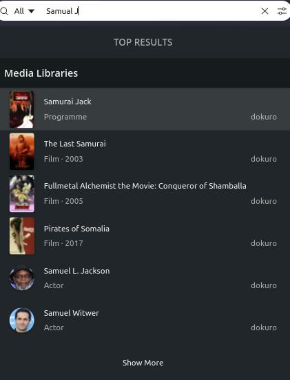
Certainly some strangeness there.
Hmm, that is odd ![]()
Mine shows up as the first result.

OK, here’s just a couple of real-world examples:
I have ten albums featuring Elvis Costello - five by him alone and five by him & The Attractions. On the old search page all ten albums would be shown:

The new drop-down list doesn’t sort on the expected artist/album/track hierarchy so it only shows one of the ten albums and then it starts listing tracks. It’s functionally impossible to see all ten albums in the new list:

Or, let’s say that I’d like to watch the episode of Good Girls called “You” but I can’t remember what season it’s in.
The old search page puts it as the very first result:
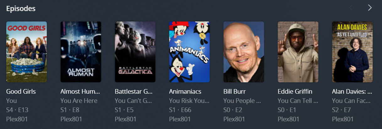
On the new drop-down list it doesn’t even show up because episodes are prioritized behind movie and show titles. There are so many movies and shows that have the words like “you”, “your”, “you’re”, “youth”, “young”, etc, etc, etc, in their title that the list hits maximum items before ever getting to episodes:

                                 .
                                 .
                                 .

Those two examples alone should be enough to tell you that the new feature is broken. It may be prettier and cleaner but it just don’t work for anything but small, simple libraries. Having both the drop-down list AND the old search page would be spectacular but breaking the functionality of the search feature sure as horse dung ain’t worth the good looks.
PLEASE restore the old search page ASAP!
Ah, your spelling is a little off so it’s not a perfect match but it does show up a bit lower.
Thanks for the detail!
Doh! How silly of me ![]()
One more oddity with the search bar itself. When you have keyboard cursor focus say in the middle of some text (see screenshot the cursor is between h and e in the word the) then the home and end keys on the keyboard do not work. You have to use the arrow keys to move along the word or click with the mouse.

Other input boxes work fine, its just the new search bar.
@anon5074910 This was reported in another thread IIRC. The issue has been raised internally. Thanks again for reporting.
@dlrohwer for your two examples
- Which album were you looking for?
- If you know the show and episode why would you exclude the show in your search?
For both examples to quickly get you to what you’re looking for we support search tokenization. So you could search
-
Elvis SpikeorElvis Blue(partial artist & partial album) -
Good YouorGirls You(partial show & episode title)
Hope that is helpful until the results page returns. Thanks for reporting your examples.
I will be bunt. After years of fully supporting Plex I’m now dabbling in Emby for the first time ever. It looks like it is definitely missing features but what Plex has done to the search has made it painfully bad. As in searching on something scrolling, then going somewhere else and then coming back you lose where you were. As in getting full details of what was searched on instead of just the name. I don’t know who decided this was the best UI choice but they really need to be reassigned to some other non critical part of the product. As this is possibly one of the worse UI choices I’ve seen since Microsoft and Windows 8.
Here’s the thing I would be OK with this IF and only if you had the option to expand the view out to a page. Call it advanced search or something.

I don’t care what. But this design is so bad that its legitimately made me look at what other options I have out there. If I could get a refund on a lifetime Pass I would be considering that as well.
Been saying this for years with some of the choices in “progress” that we all “want”… Glad to hear somebody else is considering other software that may actually have your best interest in mind.