Server Version#: Version 1.25.5.5492
Player Version#: Version 4.74.1
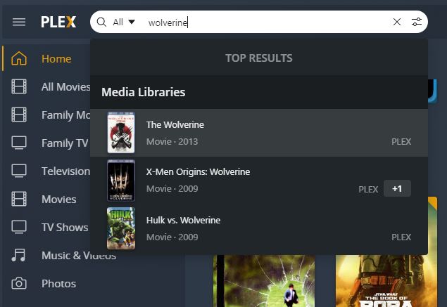
Improved Search - easily see your top search results or dig into a specific type of media no matter where you are in the app.
I’m not sure I’d consider the new search results an improvement… I think I preferred the old version, where we were sent to a search results page, rather than the scrolling drop-down method introduced with the latest version of Plex Web.
I’m in the process of re-ripping all of my blu-rays and DVD’s, and adding the new rips to a new “All Movies” library. I previously had several movie libraries, and the old search results were just easier for me to find the original library the movie was in, and then delete the old copy. The new method adds a few extra steps to do the same thing. (Select version, got to pre-play screen, etc)
May I suggest a “View all results” link to take us to an actual search results page. I think it would make maintenance (in my use case anyway) a little more convenient.
100% agree. Initially thought that if you pressed enter on the keyboard it would bring you to a results page like the previous search done but alas it does not.
Also, search for someone like Samual Jackson who is in 60+ movies on my server (checked via old webui version). Only approx 30 are shown in this drop down from what I can see. I guess it might be limited/filtered on the number of entries …
I did a search for the Beatles, the drop down results are to say the least jumbled and confusing. The Atrist, tv show, movie, track results are all over the place, and hitting the “more” link resullts in even more confusion and dis-organization.
I don’t like the way they have scoped the library searches in this new search UI.
As an example, if you search for an actor who is in two libraries, say movie and tv series. You had both results right in front of you in the UI.
Previous Search UI:
However, in this new improved version you now get a +1 button you have to click to bring up another menu so you can select what you want.
Clicking the +1 gives you this …
More clicks are is not an improvement. Previous search was better but as this is a first drop and I guess alpha ready lets see if it gets better upon our feedback.
Yes, this new search is unhelpful for the way I’ve mostly used search in the browser. I mostly use it to see if I have a certain thing or the latest episode of something. So I’d search, get a list, then I could right-click on a show, say, and open it in a new tab to look at. I’d repeat this for a bunch of searches, all in their own tabs without disturbing my current tab. Easy peasy. Useful.
Do you recall disabling the servers in the search settings? They shouldn’t have been disabled by default. Thanks for reporting back what the issue and resolution was!
Did you answer anything? This whole thread is about the crappy new search and you comment on not being able to search in your servers??? You plex employees don’t make sense, but I know from previous posts this was the answer to be expected. Only new and innovative, not anything to do with customer need or wants.
Just realized that if you use the computer running your server you can use the local web app which is a lower version with the old search. 127.0.0.1:32400/web/index.html… Hope it helps for the ETA of whenever…
It better damned well come back soon because I’ve got five family members screaming at me about switching to {insert name of competing product here} because they can’t find anything now.
Honestly, Ato, this is the worst thing that Plex has done in a long, long time. I’m normally very supportive of the dev efforts but in this case you’ve gotten it all wrong. Breaking features in the name of improving them - all in one shot - goes against every rule of customer engagement there is. NOBODY but Plex pulls stunts like this without extensive customer approval testing to make sure that they’re getting it right. Who do you recruit for your focus groups . . . six year-olds? Do you even do focus groups before making big changes? Not even Google and Microsoft are dumb enough to do things this way.
The new search is just fundamentally broken - especially on large libraries. Maybe it works for people with a couple hundred items but my 60,000+ titles are now completely unsearchable. The search doesn’t even return 10% of the expected hits on a lot of things and even when it does give you a reasonable list the drop-down format is unreadable and unusable for all but the most basic top-level items.
I hope that you guys start listening to the feedback and trash talk that’s happening all over the internet on this one and fix it fast because it’s costing you goodwill by the bucketful. I can’t believe that your investors aren’t screaming over stuff like this.
I’m not involved with any of the search work but it would be very helpful if we could get some real world examples of what you’re searching for and why it’s failing for you.
It would be helpful feedback for the team working on this as I think everyone has different needs - for instance for me the new search works perfectly, I type in what I’m looking for and the top hit is generally what I’m looking for.
If you click on the result though it takes you to all the items, is there some specific reason you want them all listed in the dropdown?
Improved Search