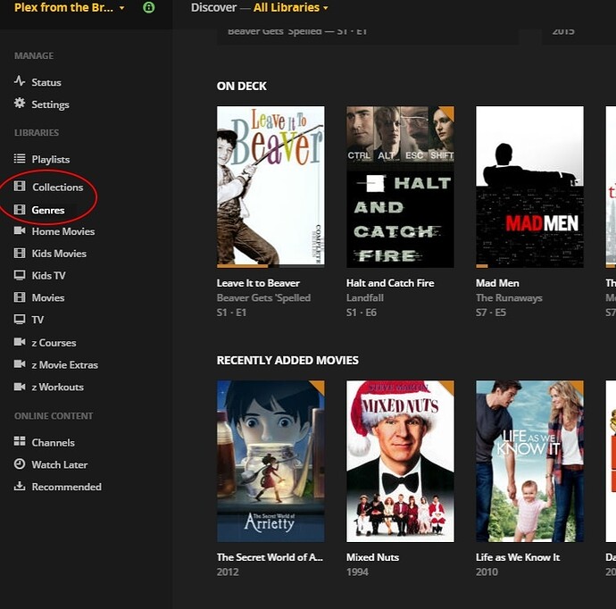
This suggestion builds on the terrific collections overhaul suggestion made by @truthfulie. His suggestion, however, lacks detail on how the user would get to his collections interface.
I suggest an option within Plex settings to elevate some of what are considered Plex filters, (eg: collections, genres, directors and actors) directly to the main menu such that they could optionally appear along side playlists and libraries. See mockups below. As @beckfield so eloquently summarized in the post where I originally floated this idea:
So you basically want to add shortcuts to the ‘genre’ and ‘collections’ filters to the main menu. So, rather than drilling down to the Movies library, then ‘Browse All,’ then go find the filter you want, you go straight to the filter from the main menu.
Yes. Exactly. This would be incredibly useful for those of us with large movie collections. Right now on the Roku, when a user wants to get to their collections they need to take the following actions:
select Movies
press OK
select All Movies
press Up
press Right
press OK
press Down
press Down
press Down
press Down
press Down
press OK
From there you need to scroll through the collection interface to choose the collection you want. Once in the collection you need to arrow around to pick the item in the collection you wish to view. An extremely onerous process.
In the mock-up below, collections and genres (circled in red) would optionally appear alongside playlists and Plex libraries in the main menu.
Clicking on a collection or genre tab would bring you to what are slightly modified versions of what you get now after the long and painful navigation to the current collections and genres interfaces.
Below is a collections mock-up. The collections would be listed in a scroll window on the left - just as they are now in the web interface. The individual collections could be sorted in numerous ways via a pull-down menu. In this mock-up I show a Star Wars collection sorted by release date:
Below is a genres mock-up. The genres would be listed in a scroll window on the left - just as they are now in the web interface. The individual genres could also be sorted in numerous ways. In this mock-up I show a film-noir genre sorted by name:
While not shown, I would also suggest a ‘viewed/unviewed’ toggle as exists in the current interface so that you could, for example, show only the unviewed movies in a current genre or the unviewed movies in a given collection.
Alternatively, the collection or genre interfaces could look more like the current playlist interface. An icon for the collection/genre could be auto-generated just as the icon is auto-generated for playlists (made up of the movie posters from movies within the collection/genre). Those icons could be sorted in any of the ways suggested above. Clicking on an icon would take you to the collection. Again, in the short term it could look just like the current playlist interface. In the long run, one looking like the collection interface suggested by @truthfulie would be ideal.
Ultimately I propose a fast route to collections/genres/favorite actors/favorite directors etc. (the latter to be discussed in a future suggestion). Four users with large libraries, the enormous number of steps it takes on the Roku and other Plex client devices to surface collections, genres etc. makes them almost unusable.
Please let me know what you think and please "Like’ this post below if you want to vote it up. Thanks.

